The Feng Shui of Color is a concept that combines the principles of Feng Shui, an ancient Chinese philosophy that aims to balance and harmonize the energy in a given space, with the psychological and emotional effects of color. The idea is to create a harmonious and balanced environment that promotes well-being and positive energy by carefully selecting and placing colors in a space.
The Feng Shui of Color is based on the idea that colors have different energies and vibrations that can affect our moods, emotions, and well-being. Different colors are associated with different emotions, moods, and energies, and by strategically placing them in a space, it is possible to create a harmonious and balanced environment that promotes positive energy.
Here are some basic principles of the Feng Shui of Color:
Color vibrations
Color vibrations refer to the unique energy and frequency associated with each color. Every color has its own specific vibration, which can affect our moods, emotions, and well-being. The concept of color vibrations is based on the idea that colors are not just aesthetic, but they also have a deeper, metaphysical significance.
Each color has its own unique vibration, which can be measured in terms of its wavelength and frequency. The vibration of a color can be thought of as its “energy signature,” which can affect the energy of a space and the people within it.
Here are some examples of color vibrations and their associated effects:
Red: Red has a high vibration and is associated with passion, energy, and excitement. It can increase blood pressure, heart rate, and respiration, and it can stimulate the senses and evoke feelings of passion and desire.
Orange: Orange has a vibration that is slightly lower than red, but still quite high. It is associated with enthusiasm, joy, and creativity, and can stimulate the mind and promote social interaction.
Yellow: Yellow has a medium to high vibration and is associated with happiness, optimism, and clarity. It can brighten up a space and promote a sense of cheerfulness and warmth.
Green: Green has a medium vibration and is associated with balance, harmony, and growth. It can promote relaxation, reduce stress, and improve vision.
Blue: Blue has a low to medium vibration and is associated with calmness, tranquility, and relaxation. It can slow down the heart rate, reduce stress, and promote feelings of trust and loyalty.
Purple: Purple has a low vibration and is associated with luxury, creativity, and wisdom. It can promote intuition, imagination, and spiritual connection.
Color harmony
The color palette should be harmonious and balanced. Complementary colors, analogous colors, and monochromatic colors can create a sense of balance and harmony in a space.
Complementary colors: Complementary colors are colors that are opposite each other on the color wheel. For example, red and green, blue and orange, and yellow and purple. Complementary colors create a sense of balance and harmony when used together.
Analogous colors: Analogous colors are colors that are next to each other on the color wheel. For example, blue, green, and yellow. Analogous colors create a sense of continuity and flow when used together.
Monochromatic colors: Monochromatic colors are different shades of the same color. For example, different shades of blue, such as sky blue, baby blue, and navy blue. Monochromatic colors create a sense of unity and coherence when used together.
Color saturation: The saturation of colors can also affect the energy of a space. Bright, bold colors can create a more energetic and vibrant environment, while softer, muted colors can create a more calming and relaxing environment.
Color contrast: The contrast between light and dark colors can also affect the energy of a space. High contrast between light and dark colors can create a more dramatic and dynamic environment, while low contrast between light and dark colors can create a more harmonious and peaceful environment.
Color temperature: The temperature of colors can also affect the energy of a space. Warm colors like red, orange, and yellow are associated with excitement, enthusiasm, and energy, while cool colors like blue, green, and purple are associated with calmness, tranquility, and relaxation.
Color psychology: Different colors can evoke different emotions and moods. For example, blue is often associated with trust, loyalty, and wisdom, while red is associated with passion, energy, and excitement.
Color culture: Colors can have different meanings in different cultures. For example, white is associated with purity and innocence in Western cultures, but it is associated with mourning in many Asian cultures.
Color lighting: Lighting can also affect the energy of a space. Warm lighting can create a cozy and inviting atmosphere, while cool lighting can create a more energetic and vibrant environment.
Color balance: The balance of colors can also affect the energy of a space. A balanced color palette can create a sense of harmony and stability, while an unbalanced color palette can create a sense of tension and discomfort.
Color placement
The strategic placement of colors can have a significant impact on the energy of a space. For example, warm colors like red and orange can be used in areas where energy and excitement are desired, while cool colors like blue and green can be used in areas where relaxation and calmness are desired.
Entrance: The entrance of a space should be welcoming and inviting. Warm colors like red, orange, and yellow can create a sense of excitement and energy.
Living room: The living room is a space for relaxation and socializing. Cool colors like blue, green, and purple can create a sense of calmness and tranquility.
Bedroom: The bedroom is a space for sleep and relaxation. Soft, muted colors like pale blue, mauve, and beige can create a sense of calmness and relaxation.
Kitchen: The kitchen is a space for creativity and nourishment. Warm colors like red, orange, and yellow can create a sense of energy and excitement.
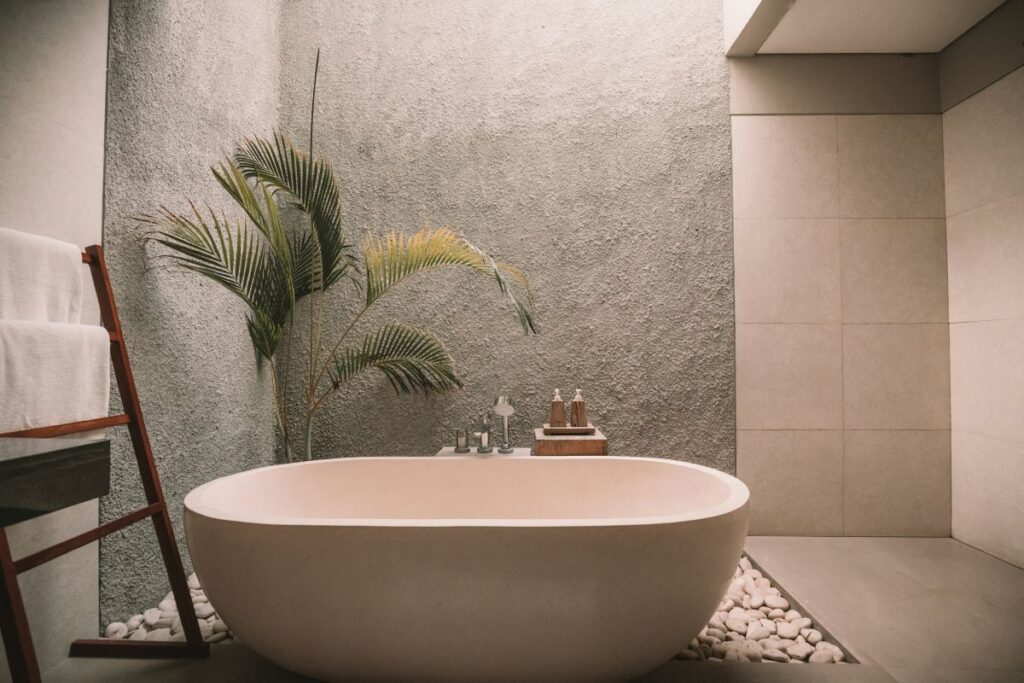
Bathroom: The bathroom is a space for relaxation and rejuvenation. Cool colors like blue, green, and purple can create a sense of calmness and tranquility.
Office: The office is a space for productivity and focus. Cool colors like blue and green can create a sense of calmness and focus.
Dining room: The dining room is a space for socializing and entertaining. Warm colors like red, orange, and yellow can create a sense of excitement and energy.
Hallway: The hallway is a transitional space that connects different rooms. Neutral colors like beige, gray, and white can create a sense of continuity and flow.
Outdoor space: The outdoor space is a space for relaxation and recreation. Cool colors like blue, green, and purple can create a sense of calmness and tranquility.
Lighting: Lighting can also affect the energy of a space. Warm lighting can create a cozy and inviting atmosphere, while cool lighting can create a more energetic and vibrant environment.
Color saturation
The saturation of colors can also affect the energy of a space. Bright, bold colors can create a more energetic and vibrant environment, while softer, muted colors can create a more calming and relaxing environment.
Bright and bold colors: Bright and bold colors like red, orange, and yellow can create a more energetic and vibrant environment. They can be used in areas where energy and excitement are desired, such as in a living room or game room.
Softer and muted colors: Softer and muted colors like pale blue, mauve, and beige can create a more calming and relaxing environment. They can be used in areas where relaxation and tranquility are desired, such as in a bedroom or meditation room.
Color contrast: The contrast between light and dark colors can also affect the energy of a space. High contrast between light and dark colors can create a more dramatic and dynamic environment, while low contrast between light and dark colors can create a more harmonious and peaceful environment.
Color gradient: A gradient of blue and green can create a sense of continuity and harmony in a space.
Color saturation and lighting: Bright, bold colors can be more vibrant and energetic in bright lighting, while softer, muted colors can be more calming and relaxing in soft lighting.
Color saturation and materials: A bright, bold color on a rug or throw pillow can create a more energetic and vibrant environment, while a softer, muted color on a wall or upholstery can create a more calming and relaxing environment.
Color saturation and pattern: A bold, geometric pattern in a bright, bold color can create a more energetic and vibrant environment, while a soft, floral pattern in a muted color can create a more calming and relaxing environment.
Color saturation and culture: In some Asian cultures, red is associated with good luck and prosperity, while in some Western cultures, black is associated with mourning and death.
Color saturation and personal preference: Ultimately, the saturation of colors is a matter of personal preference. Some people may prefer bright, bold colors, while others may prefer softer, muted colors. It’s important to consider personal preferences when selecting colors for a space.
Color symbolism
Different colors have different symbolic meanings in different cultures. For example, red is associated with good luck and prosperity in Chinese culture, while white is associated with mourning and death in many Asian cultures.
Red: Red is associated with good luck, prosperity, and energy in many cultures. It can be used in areas where energy and excitement are desired, such as in a living room or game room.
Orange: Orange is associated with warmth, enthusiasm, and creativity. It can be used in areas where creativity and inspiration are desired, such as in a home office or art studio.
Yellow: Yellow is associated with happiness, optimism, and sunshine. It can be used in areas where a bright and cheerful atmosphere is desired, such as in a kitchen or dining room.
Green: Green is associated with nature, growth, and harmony. It can be used in areas where a sense of calmness and balance is desired, such as in a bedroom or meditation room.
Blue: Blue is associated with trust, loyalty, and wisdom. It can be used in areas where a sense of trust and stability is desired, such as in a home office or meeting room.
Purple: Purple is associated with luxury, creativity, and wisdom. It can be used in areas where a sense of luxury and sophistication is desired, such as in a living room or dining room.
Pink: Pink is associated with love, nurturing, and femininity. It can be used in areas where a sense of warmth and nurturing is desired, such as in a bedroom or nursery.
Brown: Brown is associated with earth, stability, and warmth. It can be used in areas where a sense of stability and warmth is desired, such as in a living room or dining room.
Gray: Gray is associated with balance, neutrality, and sophistication. It can be used in areas where a sense of balance and neutrality is desired, such as in a home office or bathroom.
Black: Black is associated with power, elegance, and mystery. It can be used in areas where a sense of power and sophistication is desired, such as in a home office or living room.
White: White is associated with purity, innocence, and cleanliness. It can be used in areas where a sense of purity and cleanliness is desired, such as in a bedroom or bathroom.
Gold: Gold is associated with luxury, wealth, and success. It can be used in areas where a sense of luxury and success is desired, such as in a living room or dining room.
Silver: Silver is associated with elegance, sophistication, and modernity. It can be used in areas where a sense of elegance and modernity is desired, such as in a home office or kitchen.
Copper: Copper is associated with warmth, energy, and passion. It can be used in areas where a sense of warmth and energy is desired, such as in a kitchen or living room.
Crystals: Crystals are associated with clarity, purity, and healing. They can be used in areas where a sense of clarity and healing is desired, such as in a meditation room or bedroom.
Color lighting
Lighting can also affect the energy of a space. Warm lighting can create a cozy and inviting atmosphere, while cool lighting can create a more energetic and vibrant environment.
Warm lighting: Warm lighting can create a cozy and inviting atmosphere. It can be used in areas where relaxation and calmness are desired, such as in a bedroom or meditation room.
Cool lighting: Cool lighting can create a more energetic and vibrant environment. It can be used in areas where energy and excitement are desired, such as in a living room or game room.
Soft lighting: Soft lighting can create a sense of warmth and intimacy. It can be used in areas where a sense of relaxation and calmness is desired, such as in a bedroom or living room.
Bright lighting: Bright lighting can create a sense of energy and excitement. It can be used in areas where a sense of energy and vitality is desired, such as in a kitchen or exercise room.
Dim lighting: Dim lighting can create a sense of mystery and intrigue. It can be used in areas where a sense of drama and intrigue is desired, such as in a home theater or dining room.
Color temperature: Warm white lighting can create a cozy and inviting atmosphere, while cool white lighting can create a more energetic and vibrant environment.
Lighting placement: Placing lighting in the corner of a room can create a sense of warmth and intimacy, while placing lighting in the center of a room can create a sense of energy and excitement.
Lighting intensity: Bright lighting can create a sense of energy and excitement, while soft lighting can create a sense of relaxation and calmness.
Lighting color: Blue lighting can create a sense of calmness and relaxation, while red lighting can create a sense of energy and excitement.
Lighting rhythm: A steady, constant light can create a sense of stability and calmness, while a flashing or flickering light can create a sense of energy and excitement.
Color and the five elements
The five elements of Feng Shui (wood, fire, earth, metal, and water) can also be incorporated into the Feng Shui of Color. For example, wood elements can be represented by green and brown colors, while fire elements can be represented by red and orange colors.
Wood elements: Wood elements can be represented by green and brown colors. Green is associated with growth, harmony, and balance, while brown is associated with stability, warmth, and earthiness. These colors can be used in areas where a sense of growth, harmony, stability, warmth, and earthiness is desired, such as in a living room or bedroom.
Fire elements: Fire elements can be represented by red and orange colors. Red is associated with energy, passion, and excitement, while orange is associated with warmth, enthusiasm, and creativity. These colors can be used in areas where a sense of energy, passion, warmth, and creativity is desired, such as in a kitchen or game room.
Earth elements: Earth elements can be represented by yellow and beige colors. Yellow is associated with sunshine, optimism, and warmth, while beige is associated with stability, balance, and neutrality. These colors can be used in areas where a sense of warmth, stability, and balance is desired, such as in a dining room or living room.
Metal elements: Metal elements can be represented by silver and gray colors. Silver is associated with elegance, sophistication, and modernity, while gray is associated with balance, neutrality, and sophistication. These colors can be used in areas where a sense of elegance, sophistication, and balance is desired, such as in a home office or bathroom.
Water elements: Water elements can be represented by blue and black colors. Blue is associated with trust, loyalty, and wisdom, while black is associated with power, elegance, and mystery. These colors can be used in areas where a sense of trust, loyalty, wisdom, power, and elegance is desired, such as in a bedroom or home office.
By applying these principles, the Feng Shui of Color aims to create a harmonious and balanced environment that promotes positive energy and well-being. It is a holistic approach that considers the emotional, psychological, and symbolic effects of color on human behavior and well-being.