Color is never just about aesthetics; it’s a mirror reflecting our collective consciousness. It captures how we feel, what we fear, and where we hope to go. As we look toward 2026, the forecast suggests a year of balancing acts: grounding ourselves in trusted classics while boldly stepping into a digital future filled with energy and innovation.
According to leading authorities like the Pantone Color Institute, Benjamin Moore, and Elle Decor, 2026 color trends move away from minimalist monochromes. Instead, they focus on emotional depth, nature-focused inspiration, and the seamless integration of technology into our daily lives.
In this guide, you’ll explore the defining color trends for 2026, discover expert-backed palette combinations (complete with hex codes), and get practical advice on weaving these shades into your wardrobe, home, and brand identity.
Timeless Classics: Grounding and Stability
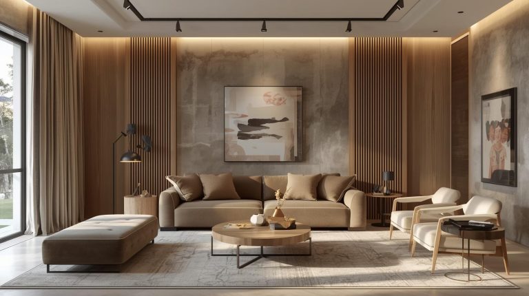
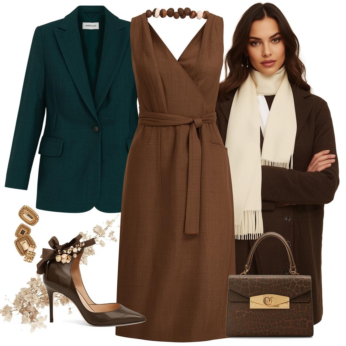
When everything moves fast, heritage colors offer grounding and stability—think deep chocolate browns and lush, smoky jades. These tones provide warmth in contemporary spaces and exude reliability and understated elegance.
Timeless Classics Palette
Scheme Example for Interiors:
-
Chocolate Brown (Hex: #4E342E): A deep, earthy tone that evokes warmth, stability, and timeless sophistication, perfect for grounding modern designs.
-
Smokey Jade (Hex: #4A635D): A muted green that bridges nature and elegance, offering a calming and restorative presence in any space.
-
Warm Ivory (Hex: #F5F5DC): A soft, neutral shade that creates a welcoming and light-filled atmosphere, ideal for versatile backdrops.
-
Muted Gold (Hex: #CBB674): A refined metallic hue that adds understated luxury and a sense of heritage to contemporary palettes.
How to Apply:
- Living Room: Paint walls warm ivory and use chocolate brown for accent walls or furniture. Add jade throw pillows and gold accessories for a contemporary, grounded effect.
- Fashion: Pair a deep jade blazer with a chocolate brown dress or accessories. These combinations work for both formal and casual looks, making a statement without boldness.
- Branding: Timeless classics are ideal for brands aiming to communicate trust and heritage—think financial or luxury goods. Use warm neutrals in your logo and marketing materials for instant credibility.
Soft Sophistication: The New Neutrals
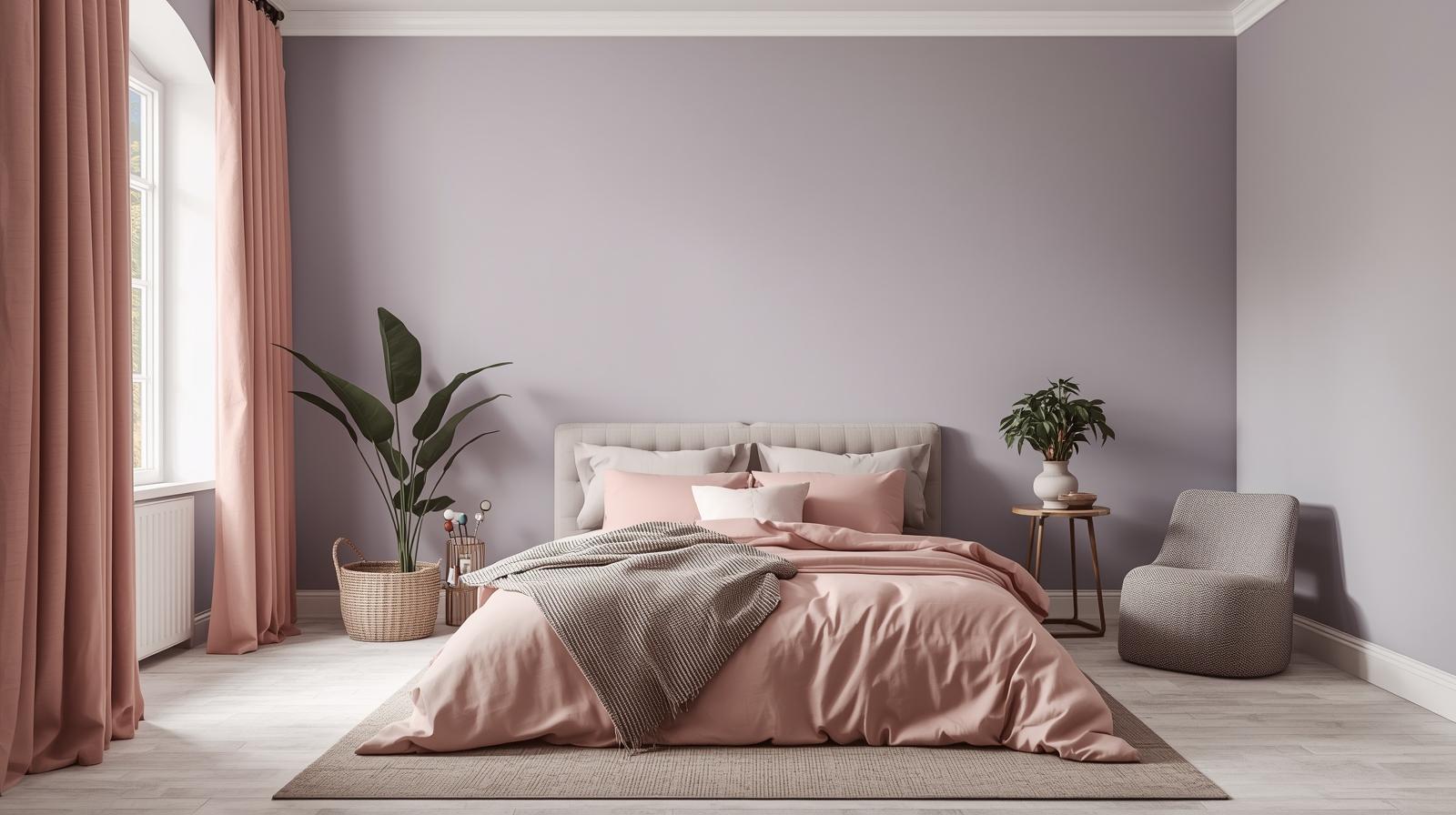
Waving goodbye to cold greys, soft sophistication blends the calming nature of pastels with approachable warmth. Lavender-grey, muted peach, and dusty rose top the list, offering environments that feel safe, restorative, and elegant.
Soft Sophistication Palette
Scheme Example for Fashion and Interiors:
-
Lavender Gray (Hex: #D8BFD8): A soothing blend of lavender and grey that balances creativity with calm, perfect for serene and modern designs.
-
Muted Peach (Hex: #FFDAB9): A soft, warm hue that radiates gentle optimism and nurtures emotional well-being in any setting.
-
Dusty Rose (Hex: #E6C3C3): A romantic and elegant shade that evokes nostalgia and modern femininity, ideal for creating a sophisticated atmosphere.
-
Soft Taupe (Hex: #CAB9A9): A versatile neutral with warm undertones, offering a timeless and grounding backdrop for both interiors and branding.
How to Apply:
- Bedroom: Try lavender-grey on walls with muted peach bedding and dusty rose curtains. Add taupe accent decor for layering and depth.
- Fashion: Monochrome looks in muted peach or layering with lavender grey creates a chic, modern silhouette that feels both nurturing and stylish.
- Branding: Perfect for wellness, beauty, and lifestyle brands. Soft and welcoming pastels in social graphics and website backgrounds communicate empathy and approachability.
Bold Statements: Emotional Expression
2026 also welcomes unapologetically vibrant hues – coral red and deep cobalt blue lead the way. These colors raise energy, inspire confidence, and ensure you stand out in any context.
Bold Statements Palette
Scheme Example for Branding and Home Accents:
-
-
Coral Red (Hex: #FF6347): A vibrant and energetic hue that inspires confidence and action, perfect for creating bold statements in design and branding.Deep Cobalt Blue (Hex: #1E4CA1): A rich and striking shade of blue that conveys authority and sophistication, ideal for professional and creative applications.Golden Yellow (Hex: #FFE066): A bright and cheerful color that radiates positivity and warmth, making it a standout choice for uplifting designs.Bright White (Hex: #FFFFFF): A pure and clean shade that symbolizes clarity and simplicity, offering a versatile foundation for any color palette.
-
How to Apply:
- Home Office: Add a coral red accent chair and cobalt blue rugs or lamps for a productivity boost. Golden yellow cushions brighten and balance the palette.
- Fashion: Dopamine dressing is in! A cobalt blue blazer paired with a coral red handbag or bright yellow scarf can shift your mood and turn heads.
- Branding: Use saturated colors in promotional campaigns and digital assets to disrupt norms, especially when targeting younger, bold audiences.
Nature-Inspired Palettes: Biophilic Design 2.0
Earthy, organic tones will continue to rise—think complex greens, terracottas, and ochres. These colors anchor us to nature, promote sustainability, and foster a sense of well-being.
Biophilic Palette
Scheme Example for Interiors and Sustainable Brands:
-
Forest Moss (Hex: #556B2F): A deep, earthy green that embodies resilience and connection to nature, perfect for biophilic designs and eco-conscious branding.Terracotta (Hex: #CC5959): A warm, earthy red that evokes rustic charm and grounded energy, ideal for creating inviting and authentic spaces.Complex Ochre (Hex: #E6B35A): A rich, golden-yellow tone that exudes warmth and sophistication, adding depth to both modern and traditional designs.Sandstone Beige (Hex: #E3DAC9): A soft, neutral shade that offers timeless elegance and versatility, serving as a calming backdrop in any setting.
How to Apply:
- Kitchen or Workspace: Forest green cabinetry or terracotta accent walls paired with ochre and sandstone trim create warmth and invite connection to the outdoors.
- Fashion: Earthy tones work as new neutrals in trousers, jackets, and accessories, creating a grounded yet modern look.
- Branding: Eco-friendly brands benefit from earth-inspired schemes—use moss green and ochre backgrounds with terracotta highlights to evoke authenticity.
Technological Fusion: The Digital Aesthetic
As our physical and digital lives merge, iridescent metallics and dreamy hues come into focus—think pearl whites with holographic effects, shimmering coppers, and digital lavenders.
Technological Fusion Palette
Scheme Example for Innovative Brands and Contemporary Spaces:
-
Pearl White (Hex: #E5E4E2): A soft, luminous shade that exudes purity and elegance, perfect for creating clean and sophisticated designs.Copper Metallic (Hex: #B87333): A warm, reflective tone that combines industrial chic with timeless luxury, ideal for adding depth and texture.Digital Lavender (Hex: #B497BD): A futuristic yet calming hue that bridges technology and wellness, making it a standout in modern palettes.Mint Pixel (Hex: #AADBC8): A fresh, vibrant green that symbolizes innovation and vitality, perfect for energizing contemporary designs.
How to Apply:
- Bathroom or Lounge: Try pearl white tiles with digital lavender accents, elevated by copper fixtures for an ethereal, spa-like vibe.
- Fashion: Iridescent or metallic accessories—like a copper clutch or lavender shoes—turn a simple outfit into a futuristic statement.
- Branding: For tech, gaming, or design-forward brands, use these futuristic hues in websites, apps, and packaging to signal progress and innovation.
Visualizing 2026 Color Schemes
Imagine stepping into a room where every shade is carefully chosen to evoke a certain mood—chocolate browns and smoky jades bring a sense of security and grounding, while soft peach and dusty rose create an atmosphere of calm and comfort. A pop of coral or cobalt can inject energy and confidence, making workspaces or creative corners feel inspiring. Earthy, nature-inspired palettes can cultivate balance and a connection with the outdoors, important for well-being in our digital age.
To harness the power of color psychology, consider how different hues make you feel and what emotional response you’d like to encourage in each space. Do you want a sanctuary for relaxation? Opt for tranquil greens and soft neutrals. Hoping to motivate and energize? Accents in bold, saturated colors can help set the tone. By thoughtfully matching colors to the purpose of a room or brand, you not only shape aesthetics—you curate experiences and tell a personal story through design.
Frequently Asked Questions: 2026 Color Trends
1. What is the most popular color for 2026?
While individual tastes vary, industry leaders predict a strong presence for warm, earthy tones like forest green and chocolate brown, as well as bold statements like cobalt blue. Soft lavenders and metallics are gaining traction, too.
2. How can I use bold colors in a small space?
Apply bold shades as accents—think front doors, throw pillows, or artwork—while keeping walls and large furnishings neutral. This creates vibrancy without overwhelming.
3. Are nature-inspired colors just a fad?
Not at all! The ongoing focus on well-being and environmental connection means earthy, biophilic palettes are here to stay, supported by decades of research into color psychology.
4. What’s the easiest way to update my branding for 2026?
Start with small changes—introduce a trending accent color in your logo, social posts, or packaging. Gradually build a palette that reflects your brand personality and values.
5. Where can I find inspiration for color combinations?
Explore resources like the Pantone Color Institute, Benjamin Moore, and design blogs. Tools like palette generators or quizzes (you can create your own with online services) make experimentation fun and easy.
Tips for Applying 2026 Color Trends Using Color Psychology
- See the impact firsthand: Create your own mood boards or gather color swatches to visualize how different 2026 color trends can influence moods and spaces. Try snapping before-and-after photos of a room or a design project to observe how the right colors transform not just the look, but the emotional feel of the space.
- Explore with purpose: Use color psychology resources and interactive tools to uncover which trending shades resonate with your intentions. Consider taking personality quizzes or experimenting with palette generators to see how different colors can support calm, boost creativity, or energize your brand or living space. Let the insights you gain guide your choices for both personal and professional projects.
- Stay inspired: Keep learning by reading up on expert articles, browsing design showcases, and following color psychology thought leaders. Seeing how others incorporate trend-forward palettes can spark fresh ideas for your own projects.
- Join the conversation: Share your experiences with different color combinations in the comments or on social media. Use your favorite palettes in your home, workspace, or creative ventures, and see how others respond—your experiments can inspire and inform the community.
Your color choices can uplift, motivate, or calm—so let your instincts and newfound knowledge guide you as you design environments that truly connect with how you want to feel or the messages you want to send. Your unique take might even inspire the wider community!
Color isn’t just about what looks good – it’s about what feels right for this moment in time. As you experiment with 2026’s color trends, from calming classics to bold innovation – remember that each scheme offers a fresh lens for self-expression and connection.
What new palette will color your world this year? The answer is as limitless as your imagination.