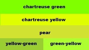
Chartreuse is a shade between the colors green and yellow, but it is typically considered a sub-category of the color green. The color was named after a French liqueur called “chartreuse” which has a greenish-yellow hue. The liqueur was first produced in 1605 by the Carthusian monks of France but was likely not marketed to the public until the 1730s. The name of this drink was first used as a color name in the year 1884 when it was mentioned in a British fashion newspaper.
|
Triad
A triad color scheme consists of three colors evenly spaced on the color wheel.
|
|
|---|---|
|
Tetrad
A tetrad color scheme uses four colors arranged into two complementary pairs.
|
|
|
Monochromatic
A monochromatic color scheme uses variations in lightness and saturation of a single color.
|
|
|
Analogous
An analogous color scheme uses colors that are adjacent to each other on the color wheel.
|
|
|
Split Complements
A split-complementary color scheme uses a base color and the two colors adjacent to its complement.
|
|
Tints
Tints are created by adding white to a base color, resulting in lighter variations of the original color.
|
|||||||||
|---|---|---|---|---|---|---|---|---|---|
|
#8bff19
|
#98ff33
|
#a5ff4c
|
#b2ff66
|
#bfff7f
|
#cbff99
|
#d8ffb2
|
#e5ffcc
|
#f2ffe5
|
#ffffff
|
|
Shades
Shades are created by adding black to a base color, resulting in darker variations of the original color.
|
|||||||||
|
#72e500
|
#65cc00
|
#58b200
|
#4c9900
|
#3f7f00
|
#326600
|
#264c00
|
#193200
|
#0c1900
|
#000000
|
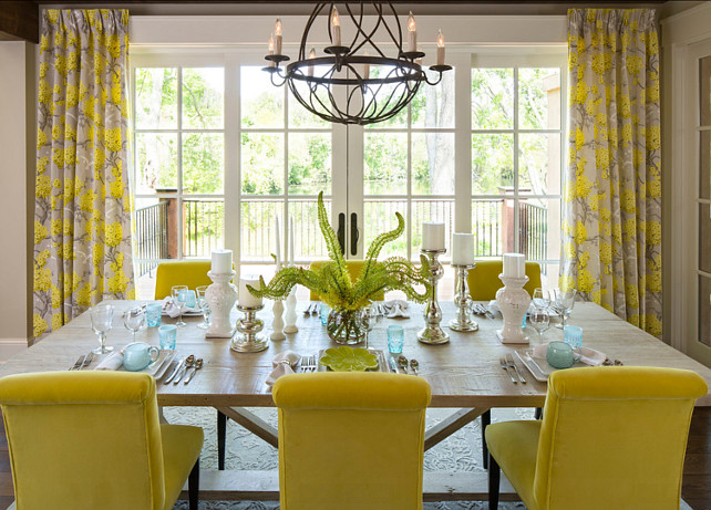
During the late 1800’s silk and velvet fabrics were being produced in chartreuse and used to make such stylish items as feather fans, gowns, purses, shoes, and hats. In the roaring 1920s, chartreuse was a very popular choice for dresses because of its bold and rebellious nature. Chartreuse resurged in the late 1950s as a common color choice for clothing and furniture. In the 1960’s, its boldness appealed to young people.
It was a unique color that could be used in both psychedelic color schemes and nature-oriented palettes. Famous fashion designers began incorporating chartreuse heavily into their creations. Though the color fell out of favor in the 1970s, it had a comeback in the late 1980s. In the 2010s, chartreuse became favored as a decorative color in offices of tech companies because the color reflects individuality and creative thinking, which are highly valued attributes in the field of technology.
Chartreuse can be seen throughout nature in many different plant species. Some common foods are considered to be chartreuse colored including pears, green apples, pistachios, limes, and avocado flesh. The gemstone tourmaline can be found in the shade of chartreuse. Because it is bright and easy to spot, chartreuse is used for tennis balls, fishing lures, and reflective safety vests.
In terms of branding and marketing, Chartreuse is often used to grab attention and draw the eye. Because the color is so vibrant and striking, it is often used in advertisements and marketing materials to create a sense of excitement and energy. Chartreuse is also a popular color choice for sports teams and other organizations that want to convey a sense of speed and agility.
When it comes to complementary colors, Chartreuse looks particularly striking when paired with dark shades such as navy blue or black. The contrast between the bright green and the dark colors creates a dynamic and visually interesting effect. Additionally, Chartreuse is often used in color palettes with other bright colors such as yellow and orange, which creates a cheerful and energetic look.
Psychology of Chartreuse:
 Chartreuse represents enthusiasm, happiness, nature, growth, and youth. Like standard green, chartreuse is associated with the liveliness and the blossoming of spring. Unlike deeper shades of green, chartreuse is rarely associated with calm and relaxation. It’s seen as a highly energetic color and is great for inspiration and motivation. It helps with focus, concentration, and creativity. People who like chartreuse are energetic and creative above all else! Their enthusiasm and positivity make them lovable, and they make friends easily. Chartreuse lovers enjoy challenges and seek adventure. On the negative side, people who gravitate to chartreuse struggle to find balance in their lives. They are caught between the calmness green offers and the excitement of yellow. This struggle can cause them to have high levels of anxiety.