Taupe (pronounced toʊp or təʊp) is a spectrum of colors that includes various shades between dark brown and gray which are similar colors. However, taupe does not refer to just one color. Instead, it describes a wide range of colors, from dark tan to brownish gray.
HEX COLOR: #483C32
RGB: (72,60,50)
CMYK: (0, 17, 31, 72)
Taupe is a neutral hue — neutrals are created by combining complementary colors (colors that are opposite each other on the color wheel) which results in desaturated brownish colors or mutes — likewise, taupe hues are achieved by mixing together umber and white pigment. You will notice that some of the lighter hues below resemble shades of warm golds while others have more of a warm undertone and move towards Rose and Red. There are a number of lighter colors and darker colors that can be used in your very own custom color palette.
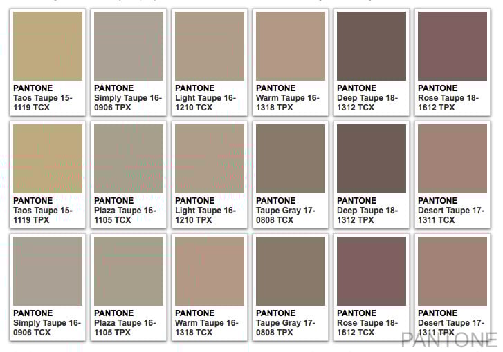
The word, taupe, originates from the French, and also the Latin word, Talpa, which translates to “mole,” as it was primarily used to describe moleskin. Notably, variations of have appeared on the Pantone Color Trend Reports over the years. Recently, ‘Warm Taupe’ was featured on the Fall 2016 color palette. Now in 2025, the color is seeing a resurgence, with many designers embracing it as a standout trend for its warmth, versatility, and calming presence in modern interiors.
As for its most common applications, taupe is an incredibly versatile color that can be used in nearly every aspect of art and design, such as home decor, architecture, branding, and fashion design.
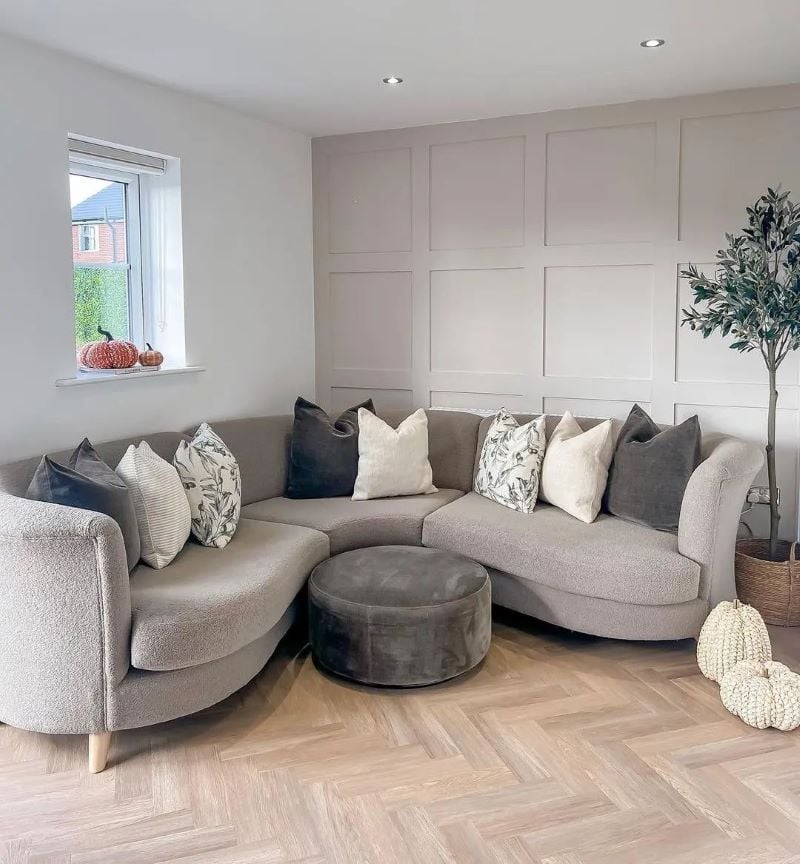
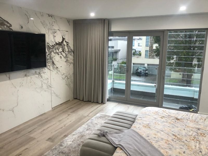
We have included a number of room images here to demonstrate different color choices that can be used for cabinetry, family rooms, dining rooms, bedrooms and even kids’ rooms. Feel free to pin your favorite images and follow us on Pinterest so we can join you on your journey of color discovery.
When used in a home color palette, it pairs best with colors that prevent it from looking dull. The easiest way to find these colors is to refer to the color wheel. First be sure to select your perfect color of taupe. The complement of taupe on the color wheel is blue, while its split complements are purple and blue. Split-complements are the two colors next to a color’s opposite color on the color wheel.
Furthermore, taupe is a muted color that is very helpful in making skin tone palettes for art and illustration. Mixing other colors with taupe creates softer versions of those colors. These new shades do not have the same brightness as the originals. They can provide a unique look, giving smooth surfaces a softer, velvety appearance.
Examples of Taupe Color Uses
Taupe Living Room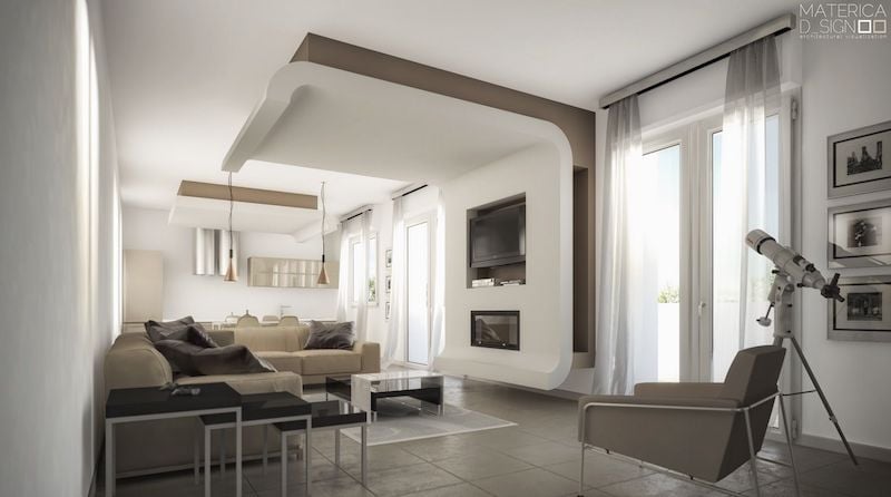
Taupe Bedroom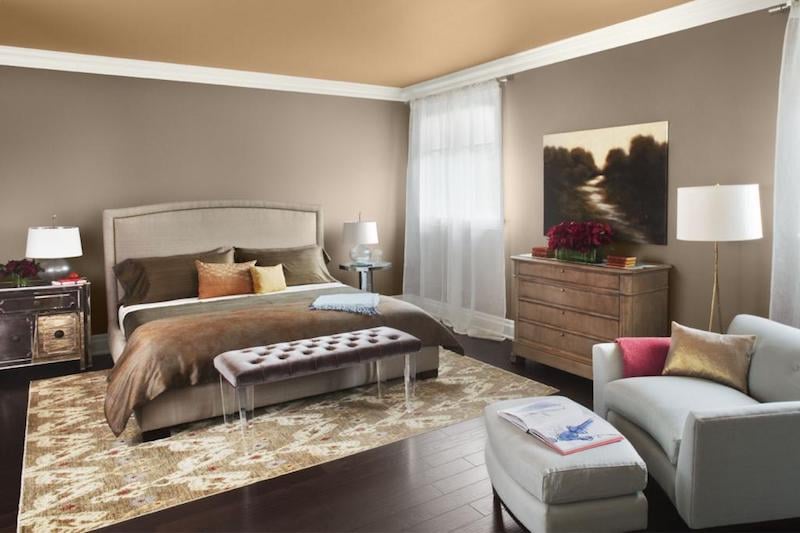
Taupe Kitchen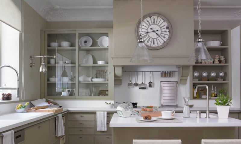
Psychology of Taupe
The psychology of the color taupe, a shade that blends brown and gray, can be quite nuanced. Often associated with neutrality, this color is timeless and practical. It is considered a very versatile color that can provide a calming, elegant, and understated background that complements a wide range of other colors, making it a popular choice in interior design, fashion, and branding.
Psychologically, taupe can convey a sense of reliability, modesty, and resilience, reflecting its grounding in earthy tones while also carrying a hint of sophistication due to its muted elegance. Its neutrality can evoke feelings of calmness and stability, making it a comforting presence in any setting. In environments, this can help to create a serene and unobtrusive space that promotes focus and composure.
In branding and marketing, taupe can be used to communicate a sense of simplicity and authenticity, appealing to consumers looking for products or experiences that are both understated and high-quality. Its sophistication and versatility make it a favored choice for brands that wish to convey timeless elegance without overwhelming their audience.
Overall, the psychology of taupe is one of balance and subtlety. It suggests a preference for the understated and dependable, without venturing too far into any extreme, making it a powerful color for creating a sense of harmony and neutrality in various applications.
What Colors Go with Taupe?
Taupe is a super flexible color that mixes well with lots of other colors, thanks to its blend of brown and gray. Here’s a rundown of colors that look great with taupe and can spice up any space:
1. White and Off-White: Matching taupe with white or off-white makes everything look clean, calm, and open. It’s a classic combo that gives off a sleek and simple vibe.
2. Soft Pastels: Light pinks, baby blues, soft purples, and mint greens go really well with taupe. They add a gentle pop of color that’s both elegant and cozy.
3. Rich Jewel Tones: If you’re aiming for a bold and luxurious feel, go for deep colors like emerald green, royal blue, or burgundy. These colors make the taupe stand out and look super rich.
4. Earthy Tones: Pair with nature-inspired colors like olive green, terracotta, burnt sienna, or mustard yellow creates a warm and inviting space that feels grounded.
5. Metallics: Gold, silver, bronze, or copper add a fancy touch to taupe, making it look even more sophisticated. Depending on the metal, you can make the space feel warmer or cooler.
6. Dark Neutrals: Dark colors like charcoal, navy, or deep brown create a cool contrast with taupe, making the space look bold and interesting.
7. Black and Charcoal: For a modern and chic look, mix taupe with black or charcoal. This mix is perfect for adding some drama and depth.
8. Warm Reds: Shades of red like brick or rust bring a lively yet earthy feel to taupe spaces, making everything feel warm and inviting.
9. Greens: Greens from sage to forest can make a taupe room feel fresh and peaceful, perfect for a chill and refreshing vibe.
10. Blues: Light to medium blues, like sky blue and denim, are great with taupe, adding a relaxed and calm atmosphere to the mix.
When selecting complementary colors, think about the shade of taupe you have selected (is it more brown or gray?) and the feel you want for your space. Being amazingly versatile, this color can can swing between warm and cool looks, giving you lots of ways to play around with your home decor or outfit.
FAQ About Color Taupe
The color taupe is a blend of gray and brown. It’s a very versatile color that can be used in both modern and classic designs. Taupe is often used as a neutral in interior design, but it’s also a great accent color that can be paired with other colors to create unique combinations.
Darker shades of taupe are best paired with darker shades of blue, such as midnight blue or navy. These colors create a balance between the warm and cool tones in the outfit and help create a cohesive look. Lighter shades of taupe work well with lighter shades of yellow, such as buttery yellows or creamy yellows. These colors also create a balance between warm and cool tones while still being vibrant enough to stand out against the neutral shade of taupe.
It’s true that taupe and khaki are often used interchangeably, but they are actually quite different. Taupe is a gray-brown color that can be described as ‘a pale brownish gray’. It’s a neutral color that goes well with most other shades, making it ideal for decorating. Khaki, on the other hand, is a light brownish-green color that is often associated with military uniforms. It’s derived from the Urdu word for ‘dusty,’ which gives you an idea of what it looks like. It’s also often referred to as ‘khaki green.’