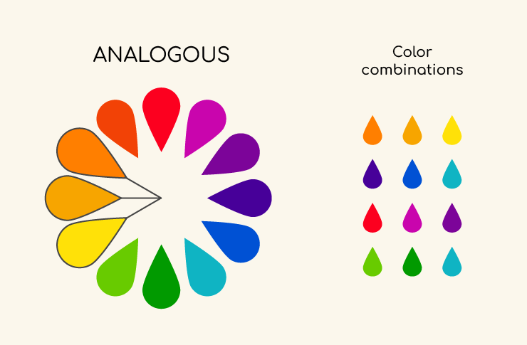
Analogous colors are colors that sit next to each other on the color wheel. They usually share a common color component and create a harmonious and pleasing look when used together because of their close relationship. An analogous color scheme might include three or more colors that are adjacent to each other on the color wheel.
For example, if you pick a primary color like blue, the analogous colors would be the ones directly next to it on either side of the color wheel, such as blue-green on one side and blue-violet on the other. This scheme creates a serene and comfortable design, often found in nature, making it very pleasing to the eye.
Using analogous colors in design can create a more cohesive and harmonious look, offering a sense of visual unity. Designers often use one of the analogous colors as the dominant color while the others serve as accent colors, ensuring that the overall design remains balanced and not overwhelming. This approach is popular in various fields, including interior design, fashion, and graphic design, to create visually appealing and cohesive compositions.
How Do You Use Them?
Using analogous colors effectively in design involves a few key principles to create a harmonious and visually appealing outcome. Here’s how to use analogous colors successfully:
1. Choose Your Main Color: Start by selecting your main color, which will be the dominant hue in your design. This color sets the overall mood and tone.
2. Select Adjacent Colors: Pick two to three colors that are next to your main color on the color wheel. These will be your analogous colors. For instance, if you choose blue as your main color, you might select blue-green and blue-violet as your adjacent analogous colors.
3. Decide on Proportions: Use the 60-30-10 rule for a balanced composition. This means 60% of the space uses the dominant color, 30% uses the secondary color, and 10% uses an accent color. This helps to ensure that your design is not overwhelming and maintains a sense of harmony.
4. Vary the Saturation and Brightness: To add depth and interest to your design, vary the saturation (intensity) and brightness (lightness or darkness) of the analogous colors. This can prevent your design from looking flat and one-dimensional.
5. Add Neutrals: Incorporating neutral colors like white, black, or gray can help balance the color scheme and provide areas of rest for the eye, especially in interior design and fashion.
6. Use Textures and Patterns: Especially in interior design and fashion, textures and patterns can add depth and interest to your design, preventing it from feeling too “matchy-matchy” or bland.
7. Consider the Color Temperature: Analogous color schemes can be either warm (reds, oranges, yellows) or cool (greens, blues, purples). Stick to one temperature in your scheme to maintain cohesiveness.
8. Application in Different Fields:
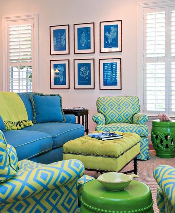
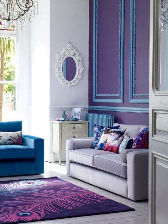
a. Interior Design: Use analogous colors for walls, furniture, and accents to create a cohesive and tranquil space.
b. Graphic Design: Apply analogous colors in backgrounds, typography, and imagery to create visually appealing layouts with depth.
c. Fashion: Combine clothing and accessories in analogous colors for outfits that are visually interesting yet harmonious.
9. Test Your Palette: Before finalizing, test your color palette in different lights and applications to ensure it works well under various conditions and settings.
By following these guidelines, you can use analogous colors to create designs that are vibrant yet harmonious, with just the right balance of unity and diversity.
Analogous Colors Design Layout
Out of your set of analogous colors, it is best to choose one that is more dominant than the others. This way the colors aren’t trying to compete with each other for attention. For example, if you need to create a textile using red, red-orange, and orange, it may look best to choose the red-orange color as your dominant one and use the other two as accents. Typically, a designer will choose the middle color as the predominant color for a layout. However, this is a subjective decision and will be dependent on the context of the design.
Deciding Whether To Use Analogous Colors Or Not
Deciding to use analogous colors depends on the effect you’re aiming for in your design or project. Here’s how to determine if an analogous color scheme is right for you:
When to Use Analogous Colors
Harmony and Unity: If you want your design to feel cohesive and harmonious, analogous colors are a great choice. They naturally work well together and create a pleasing visual experience.
Subtle Backgrounds: For projects where the background shouldn’t dominate, analogous colors can create a soft, unified backdrop that allows other elements (like text or focal points) to stand out.
Nature-Inspired Themes: Many scenes in nature use analogous colors (think of a sunset or the greens in a forest). If you’re aiming for a natural, organic feel, these colors can enhance that vibe.
Emotional Impact: Different color temperatures can evoke different feelings. Warm analogous colors (reds, oranges, yellows) can evoke warmth and energy, while cool colors (blues, greens, purples) can create a calm and soothing atmosphere.
When to Consider Other Options
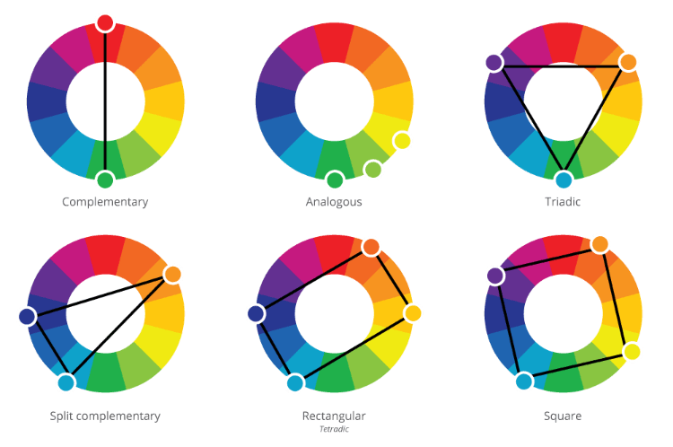
High Contrast Needs: If your design requires high contrast to draw attention or direct user behavior (like in calls to action on websites), a complementary color scheme (colors opposite each other on the color wheel) might be more effective.
Vibrancy and Energy: While analogous colors can be vibrant, they generally don’t offer the same level of energy and dynamism that contrasting colors do. If you want your design to pop and have a lot of energy, you might explore more contrasting color schemes.
Avoiding Monotony: Relying solely on analogous colors without incorporating enough variation in hue, saturation, and brightness can sometimes lead to a design that feels flat or monotonous. Mixing in some neutral colors or even a splash of a complementary or triadic color can help prevent this.
Tips for Decision Making
Consider Your Audience: Think about the psychological effects of colors on your target audience and what emotions you want to evoke.
Purpose of the Design: The goal of your project should guide your color choices. Is it to soothe, energize, inform, or entertain?
Experimentation: Don’t be afraid to experiment with color schemes. Sometimes the best way to decide is to create mock-ups with different schemes and see which one aligns with your objectives.
Ultimately, whether to use analogous colors comes down to the specific needs of your project and the message or mood you wish to convey. Mixing and matching color schemes based on your goals can lead to a more dynamic and effective design.
Tip: Go to your local hardware store and pick out some analogous colors from their paper samples section. Have fun matching the analogous colors and experimenting with color schemes.
I never knew….Very interesting, I have been learning a lot about sound,color and smell. Our little brain has been held back from what it is capable of. Example my English in the last sentence. I know ending in the word “of” is not right or it doesn’t look right….Smile;)
can blue green and purple be taken as analogous colors?
Hello: how do we purchase colors from the examples on your website?
This post really clarified the concept of analogous colors for me! I loved the examples you provided, especially how they can create a sense of harmony in a design. I’m excited to try this out in my next project! Thank you for the great insights!