Charcoal gray stands out in the wide array of colors that envelop us, embodying a unique blend of sophistication and versatility. It transcends being merely a darker shade of gray; this color holds deep psychological significance, a rich historical background, and endless possibilities in design. This deep, smoky tone is imbued with meanings that go well beyond its visual appeal, affecting our emotions, our environments, and even how we express ourselves.
Defining Charcoal Gray: More Than Just a Shade
Charcoal gray holds a special place in the color spectrum. While many find it challenging to pinpoint exactly what shade charcoal gray is, professional designers and color theorists describe it as a deep, muted gray with hints of blue or brown undertones. The name comes from actual charcoal—the carbon-rich substance produced by burning wood without oxygen. This link to its namesake gives charcoal gray its unique depth and subtle texture in visual representation.
In contrast to standard gray, which can often seem flat or neutral, charcoal gray offers a richness and dimension. Typically, charcoal gray falls within the hexadecimal range of #36454F to #1C1C1C, depending on its specific variation. It is positioned just above black on the value scale but maintains enough lightness to be recognized as gray rather than pure black.
The Historical Journey of Charcoal Gray
The concept of charcoal gray as a color has roots that trace back to ancient civilizations. Early humans utilized charcoal not just for making fire but also as one of the earliest materials for drawing. Cave paintings from around 40,000 years ago reveal the use of charcoal to create deep shadows and outlines, marking the initial artistic uses of what we now call charcoal gray.
In the realm of fashion, charcoal gray gained significance during the Victorian era, a time when somber and dignified colors were prevalent in men’s formalwear. It offered a refined alternative to the starkness of pure black, providing a subtle distinction while still adhering to societal norms. By the 20th century, charcoal gray had established itself as a key component of business attire, symbolizing professionalism, reliability, and a quiet confidence.
In the fields of art and design, charcoal gray became prominent through the works of early 20th-century photographers and filmmakers. The film noir genre, characterized by its dramatic shadows and moody settings, transformed charcoal gray from a mere color into a powerful aesthetic choice—one that conveyed mystery, sophistication, and emotional complexity.
Charcoal Gray Color Palette
-
Deep Charcoal (Hex: #36454F): A profound, inky variation with blue undertones.
-
Slate Charcoal (Hex: #4E5754): A medium-depth shade with subtle mineral qualities.
-
Graphite Gray (Hex: #303841): A rich, sophisticated variation with cool undertones.
-
Steel Charcoal (Hex: #4F5555): A balanced, matte shade with industrial elegance.
-
Smoky Charcoal (Hex: #414A4C): A nuanced, versatile variation with subtle depth.
The Psychology Behind Charcoal Gray
Colors have a significant impact on our psychology, and charcoal gray is a prime example. Unlike lighter shades of gray that may seem uncertain or emotionally neutral, charcoal gray conveys authority, sophistication, and confidence. It retains much of the formality and power associated with black but presents these traits in a more subtle and approachable manner. Studies in color psychology indicate that charcoal gray can evoke feelings of:
Security and protection: The richness of charcoal gray fosters a sense of shelter and safety, which is why it’s often used in protective clothing and secure settings.
Sophistication and maturity: Charcoal gray expresses experience and refinement without the weight or finality that black can bring.
Focus and concentration: The understated yet commanding presence of charcoal gray creates an environment that encourages deep thought and careful consideration.
Balance and neutrality: As a color that steers clear of extremes, charcoal gray acts as a psychological anchor, fostering emotional stability and rational thinking.
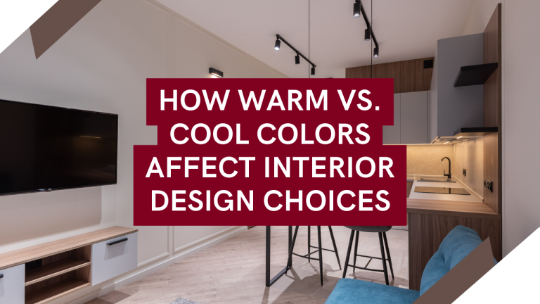
Charcoal Gray in Interior Design
Interior designers have long appreciated the remarkable versatility and elegant presence of charcoal gray. When used as a wall color, it adds dramatic depth while being more livable than black. It works beautifully as an accent wall in living areas, drawing attention and adding dimension without being overpowering.
In terms of furniture, charcoal gray upholstery has become a symbol of modern elegance. A charcoal gray sofa or armchair serves as a strong focal point in a living space, offering a neutral base that pairs well with nearly any accent color. This flexibility is why charcoal gray has moved beyond being just a trend to become a timeless choice for designers.
Fashion and Personal Expression Through Charcoal Gray
Charcoal gray occupies a prominent place in the fashion world. A charcoal gray suit conveys professionalism and dependability without the harshness that can come with black. This subtle difference makes it especially useful in business environments where being approachable is just as important as exuding authority.
Charcoal gray clothing is incredibly versatile. It pairs beautifully with almost any color, from bold primaries to soft pastels and other neutrals. This flexibility also applies to metallics; charcoal gray works well with both silver and gold tones, adding a touch of elegance.
On a deeper level, opting for charcoal gray often signals a desire to project competence, reliability, and a sense of measured restraint. Unlike more trendy colors, charcoal gray suggests a person who prioritizes substance over passing fads—someone who possesses confidence without needing to shout it out loud.
Charcoal Gray in Brand Identity and Marketing
Corporate entities have long understood the communicative strength of charcoal gray. In logo design and brand identity, this color conveys stability, intelligence, and lasting quality. It’s no surprise that numerous financial institutions, legal firms, and luxury brands use charcoal gray in their visual identities.
In marketing, charcoal gray serves as an excellent backdrop for other elements to stand out. Product photography featuring charcoal gray backgrounds allows the product to take center stage while benefiting from the sophisticated context the color offers. This strategic approach explains why many premium products—from electronics to fragrances—are showcased against charcoal gray backgrounds.
Complementary Colors and Harmonious Pairings
Understanding which colors complement charcoal gray is crucial for effective design application. This elegant neutral pairs exceptionally well with:
Pale pinks and blushes: The contrast between the depth of charcoal and the softness of blush creates a refined tension that feels both modern and timeless.
Mustard yellows: This combination balances the coolness of charcoal with the warmth of mustard, resulting in a visually striking yet harmonious look.
Emerald greens: Together, these colors evoke a sense of natural sophistication, reminiscent of deep forest tones at dusk.
Metallic accents: Silver, gold, and copper all shine beautifully against charcoal gray, which serves as a sophisticated backdrop to their brilliance.
Charcoal Gray in Digital Design and Technology
The digital landscape has adopted charcoal gray for both its visual appeal and practical benefits. Numerous user interfaces feature charcoal gray backgrounds to minimize eye strain during long periods of screen time. This color offers enough contrast for clear white or light-colored text while being gentler on the eyes than pure black.
Software developers and UX designers have also found that charcoal gray interfaces exude sophistication and professionalism. Whether in photo editing tools or financial applications, charcoal gray fosters a serious, focused atmosphere that encourages users to immerse themselves in their tasks.
Conclusion
Charcoal gray holds a significance that goes well beyond mere color choice. It embodies a striking balance of contrasting qualities: it’s both dramatic and subtle, authoritative yet friendly, trendy while also being timeless. This unique versatility is why charcoal gray has remained relevant through the ages and across various contexts.
Whether you’re thinking about incorporating charcoal gray into your wardrobe, living space, or brand identity, recognizing its deep psychological and cultural meanings can help you fully leverage its expressive capabilities. More than just a darker hue of gray, charcoal gray is a color rich in depth, history, and significant communicative power.