Looking to refresh your interior design in 2026? Taupe is more popular than ever, offering a neutral palette that complements a wide range of styles. Dive into our comprehensive guide to discover innovative ways to incorporate taupe into your living space.
Understanding the Versatility of Taupe in Interior Design
Taupe is a sophisticated, muted color that blends brown and gray tones, making it a highly versatile choice for interior decorating. Its neutral nature allows it to adapt seamlessly across various design styles, from modern minimalism to classic elegance. In 2026, taupe continues to be favored for its ability to create warm, inviting atmospheres while remaining understated and chic.
One of the reasons taupe has become so popular is its adaptability. It acts as a perfect backdrop for bold accents or detailed textures, all while maintaining a calming aesthetic. Whether used on walls, furniture, or accessories, taupe can serve as a unifying element in your interior design.
Top Taupe Color Combinations for 2026
Pairing taupe effectively can elevate your space. Here are some of the most trendy and timeless taupe combinations for 2026:
1. Taupe and Crisp Whites
This classic pairing creates a clean, fresh look perfect for modern interiors. Use white on walls or trim with taupe furniture or textiles for a balanced, airy feel.
2. Taupe and Deep Charcoal
For a more sophisticated ambiance, combining taupe with charcoal adds depth and contrast. Ideal for accent walls, furnishings, or decorative elements.
3. Taupe and Soft Pastels
Blending taupe with pastel shades like blush pink, mint green, or powder blue produces a gentle, soothing environment—great for bedrooms and relaxation spaces.
4. Taupe and Metallic Accents
Gold, bronze, or chrome accessories paired with taupe bring a touch of luxury and glamour, fitting perfectly into 2026’s high-end interior trends.
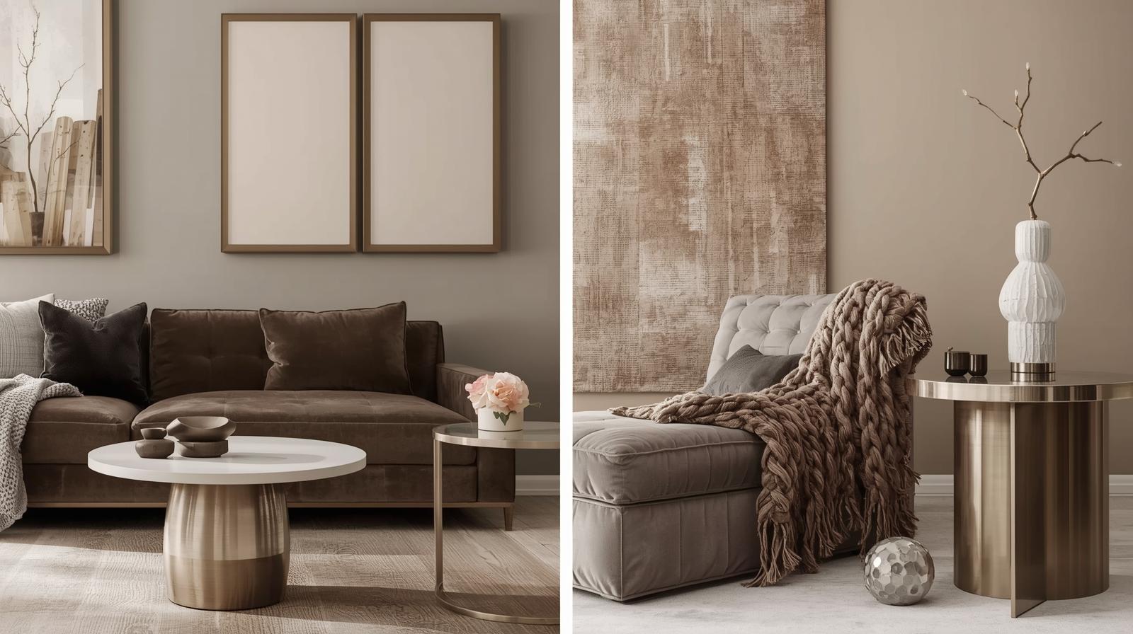
Using Taupe as a Base for Modern Living Rooms
Modern living rooms benefit immensely from taupe’s neutrality. Consider taupe walls as a canvas for vibrant art or patterned rugs. Use taupe-colored sofas or armchairs for a timeless look, complemented by colorful cushions or throws to add personality.
In 2026, integrating different textures—such as velvet upholstery, woven throws, and sleek metals—can enhance taupe’s understated elegance. Layering these textures creates visual interest and tactile comfort in your living space.
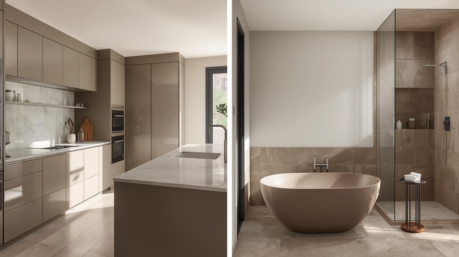
Incorporating Taupe into Kitchen and Bathroom Designs
Taupe is a fantastic choice for kitchen cabinets, backsplashes, and bathroom vanities. Its warm undertones add coziness while maintaining a clean, modern aesthetic. In 2026, matte taupe finishes are especially popular for cabinetry, offering a sophisticated, low-maintenance appearance.
For countertops, explore materials like quartz or marble in taupe shades, which add a subtle elegance. Complement these with brushed nickel or matte black fixtures that pair seamlessly with taupe surfaces for a contemporary look.
Trends in Taupe Decor and Accessories for 2026
Decor trends in 2026 emphasize sustainable and textured accessories. Taupe-colored decor items—such as rugs, throws, vases, and wall art—bring warmth and cohesion to your design. Natural materials like wood, rattan, and linen in taupe hues are increasingly popular, emphasizing organic, eco-friendly decorating styles.
Additionally, statement lighting fixtures with taupe shades or accents are trending, adding both functionality and aesthetic appeal. Incorporate modern chandeliers, pendant lights, or table lamps in taupe to create a cozy yet stylish ambiance.
Tips for Choosing the Right Taupe Shades for Your Space
Since taupe comes in a wide spectrum of shades—from warm beige tones to cool gray-brown hues—it’s essential to select the right one for your space. Here are some tips:
- Observe your natural light: Warm, sunny rooms might benefit from cooler taupes, while north-facing spaces can be warmed up with warmer shades.
- Test samples: Always test paint or fabric samples in your space to see how they look at different times of day.
- Consider the mood: Think about whether you want a calming, energizing, or luxurious atmosphere, which can influence your choice of taupe shade.
- Coordinate with existing elements: Match your taupe with existing flooring, furniture, or architectural details for a harmonious look.
Maintaining and Updating Taupe Interiors in 2026
Maintaining taupe interiors is straightforward thanks to its neutral nature. Regular cleaning, updating accessories, and occasional touch-ups can keep the space looking fresh. In 2026, consider seasonal updates—such as swapping out textile accents or changing cushion covers—to keep your taupe decor current and engaging.
To update your taupe-based interior, integrate trending textured fabrics or metallic accents that reflect the latest design innovations. Keep an eye on eco-friendly decor options, as sustainability continues to influence interior style in 2026.
In conclusion, taupe remains a cornerstone of sophisticated, versatile interior design in 2026. Its adaptability, inviting warmth, and timeless appeal make it an excellent choice for creating cozy yet stylish living spaces. By understanding its versatility and pairing it thoughtfully with other colors and textures, you can design a space that feels both contemporary and welcoming.