Have you ever noticed how certain colors can make you feel down? Colors aren’t just things we see – they can actually change how we feel. Some colors make us happy and energetic, while others can make us feel sad or blue. In this article, we’ll explore what color resembles sadness the most and why certain sad colors affect our emotions the way they do.
The Science Behind Colors and Emotions
Before we dive into which colors are the saddest, it’s helpful to understand how colors affect us in the first place. Our brains make connections between colors and feelings based on our experiences and what we see in nature. These connections happen almost automatically, without us even thinking about them.

For example, bright colors like yellow might remind us of sunshine and happy days, while darker colors might remind us of cloudy skies or nighttime. These associations help explain why some colors feel sad to us.
What Color Resembles Sadness the Most?
When most people think about sad colors, a few specific ones usually come to mind:
Blue: The Classic Color of Sadness
Blue is probably the color most commonly linked to sadness. We even use phrases like “feeling blue” or having “the blues” when we’re sad. Darker and grayish blues especially can create feelings of sadness, loneliness, or emptiness.
But why is blue so connected to sadness? One reason might be that blue reminds us of rain, cold weather, or nightfall – times when we might naturally feel more down. Blue can also feel distant or cold compared to warm colors like red or orange.
Blue Shades and Their Emotional Effects
-
Deep Navy (Hex: #001F3F): The darkest blue, associated with profound sadness and emptiness.
-
Steel Blue (Hex: #4682B4): A muted blue that evokes melancholy and thoughtfulness.
-
Slate Blue (Hex: #6A5ACD): A blue-purple shade associated with loneliness and reflection.
-
Dusty Blue (Hex: #8BA8B7): A grayish-blue that creates feelings of distance and detachment.
-
Midnight Blue (Hex: #191970): Deep and dark, reminiscent of the night sky and isolation.
Interestingly, not all blues feel sad. Light, bright blues can actually feel peaceful or calming instead of sad. It’s usually the darker, duller blues that bring on the sad feelings.
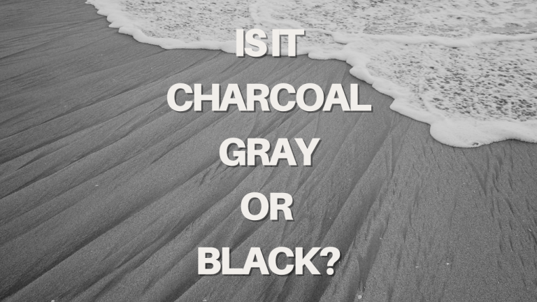
Gray: The Color of Gloom
Gray is another top contender for the saddest color. Gray skies often signal rainy days, and the lack of color in gray can feel depressing or boring. Gray makes many people think of:
- Cloudy, rainy days
- Old age
- Concrete and industrial areas
- Boredom and monotony
-
Charcoal Gray (Hex: #36454F): A deep, dark gray that conveys heaviness and gloom.
-
Storm Gray (Hex: #708090): Reminiscent of stormy skies and rainy days, conveying uncertainty.
-
Concrete Gray (Hex: #95A5A6): An industrial gray that feels lifeless and monotonous.
-
Silver Gray (Hex: #C0C0C0): A lighter gray that feels empty and lacking warmth.
-
Ash Gray (Hex: #B2BEB5): A dull gray with green undertones, associated with decay.
Gray lacks the energy and excitement of brighter colors, which is why it often makes spaces feel sad or lifeless. When everything looks gray, the world can seem dull and uninspiring.
Black: The Color of Loss
Black has long been associated with mourning and loss in many cultures. People wear black to funerals, and black can symbolize the absence of light and hope. As the darkest color, black can create feelings of:
- Grief
- Fear
- Emptiness
- Finality
-
Pure Black (Hex: #000000): The absence of color, representing grief, loss, and finality.
-
Rich Black (Hex: #010203): A deep black with subtle blue undertones, conveying depth and void.
-
Raven Black (Hex: #1B1B1B): A slightly softer black associated with mystery and mourning.
-
Obsidian Black (Hex: #0D0D0D): A reflective black that suggests emptiness and desolation.
-
Charcoal Black (Hex: #2C2C2C): A muted black that feels somber and serious.
However, black is more complex than just being sad. Many people also see black as elegant, sophisticated, or powerful. Still, in certain contexts, black definitely ranks high among sad colors.
Brown: The Color of Decay
Brown doesn’t always get mentioned as a sad color, but darker browns can create feelings of sadness because they remind us of:
- Dying plants
- Fall and winter (when things stop growing)
- Dirt and decay
- Dullness
Brown Shades and Their Emotional Effects
-
Dark Chocolate (Hex: #3D2314): A deep, dark brown associated with heaviness and seriousness.
-
Muddy Brown (Hex: #614E1A): A dull, earthy brown that evokes decay and stagnation.
-
Coffee Brown (Hex: #4A2C2A): A rich brown with reddish undertones, conveying depth and solemnity.
-
Umber Brown (Hex: #635147): A muted, grayish-brown associated with aging and decline.
-
Taupe Brown (Hex: #8B7355): A desaturated brown that feels dull and lifeless.
Muddy or grayish browns especially can feel sad or depressing compared to richer, warmer browns that might feel more cozy or natural.
Why Some Colors Make Us Feel Sad
Understanding what color resembles sadness isn’t just about listing colors – it’s also about understanding why they affect us this way. Several factors influence why certain colors feel sad:
Brightness and Saturation Matter
Colors that are less bright and less saturated (more grayish) tend to feel sadder than bright, vibrant colors. This might be because:
- Bright colors catch our attention and stimulate our minds
- Dull colors lack energy and can make us feel less motivated
- In nature, vibrant colors often signal health and life
When colors look faded or washed out, they can remind us of things that are old, tired, or dying – all things that might make us feel sad.
How Sad Colors Are Used
Understanding sad colors isn’t just interesting – it’s also useful. People use sad colors deliberately in many different ways:
In Art and Photography
Artists often use sad colors to create certain moods in their work. Think about old black and white photographs or paintings that use lots of blues and grays. These color choices help the viewer feel what the artist wants them to feel.
Movie directors do this too – notice how sad or serious scenes often have a blue or gray color filter over them. These color choices tell your brain how to feel even before anything happens in the scene.
In Design and Marketing
Designers are very careful about color choices. They might use:
- Brighter colors for fun products like toys
- More serious or sad colors for things like insurance or medicine
- Blues and grays for professional settings
Even businesses that want to seem reliable and serious might use colors that some would consider sad, like navy blue or gray, because these colors also feel stable and trustworthy.
Finding Balance with Sad Colors
Even though we’ve been talking about sad colors as negative, they’re not always bad to have around. In fact, sad colors can be:
- Calming when you’re overwhelmed
- Helpful for creating peaceful environments
- Beautiful in their own way
- Important for balance in design
Too many bright, happy colors can actually be overwhelming or stressful. Sad colors give our eyes and minds a place to rest.
Conclusion
So what color resembles sadness the most? While blue, gray, black, and certain browns top the list of sad colors, how they affect us depends on many factors. Their shade, how they’re used, and our personal and cultural associations all play a role in whether a color makes us feel down.
Understanding sad colors can help us make better choices about the colors we surround ourselves with and how we use colors to communicate feelings. And remember – even sad colors have their place and can be beautiful in the right context.
Next time you’re feeling blue, take a look around. The colors in your environment might be affecting your mood more than you realize!