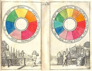
Since 1666 when Sir Isaac Newton developed the color wheel, this visual resource has been revisited, updated, and used by artists to represent the various hues derived from the primary colors. It is a fundamental tool not just for painters, but for anyone looking to understand the emotional language of the visual world.
Over time, our knowledge about how colors evoke emotion and subtly influence thinking has expanded significantly. Central to this understanding is the concept of color temperature—the categorization of hues into warm and cool groups. This distinction is far more than an artistic convention; it is a psychological key that unlocks how we perceive spaces, brands, and even our own moods.
How Colors Are Categorized
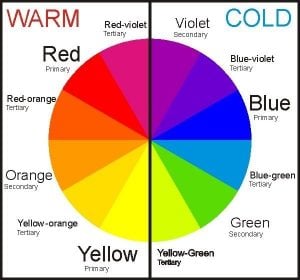
To understand temperature, we must first look at the map: the color wheel. Colors are categorized as warm and cool based on their specific placement on this circular spectrum.
The wheel is anchored by the three primary colors: red, blue, and yellow. These are the parents of the chromatic family. When mixed, they create secondary colors (green, orange, and violet). Mixing a primary with a secondary results in tertiary colors, filling out the nuanced gaps in the wheel.
Imagine drawing a line directly through the centre of the wheel. On one side, you have the vibrant energy of reds, oranges, and yellows. On the other, the soothing depths of blues, greens, and violets. This division creates the binary of warm and cool.
Why Colors are Labeled as Warm and Cool
Why do we attribute temperature to visual wavelengths? It is largely due to the physical and emotional associations we make with nature.
Warm colors (reds, yellows, oranges) are the colors of heat sources: the sun, fire, glowing embers, and summer days. They physically feel closer to us. In visual terms, they have long wavelengths and tend to “advance,” meaning they appear to come forward in space.
Cool colors (blues, greens, violets) are reminiscent of cooler natural elements: water, ice, lush grass, and the night sky. These hues have shorter wavelengths and tend to “recede,” appearing to move away from the viewer. This creates a sense of depth and distance, much like a mountain range fading into a blue horizon.
Psychological Effects of Warm and Cool Colors
Color Psychology is not a passive element; it is an active psychological force. The temperature of a color can drastically alter the mood of an environment and the state of mind of the people within it.
Generally, warm colors are stimulating and can put people in a cheerful mood. They grab attention, increase heart rates, and can even stimulate appetite. They are the extroverts of the spectrum. Cool colors are the introverts. They are calming, soothing, and mentally restorative, often lowering blood pressure and reducing anxiety and depression.
Introduction To The Color Wheel And Its History
While we often think of color theory as a modern design concept, its roots are deep in scientific history. Sir Isaac Newton’s experiments with prisms in the late 17th century revealed that white light is actually composed of a spectrum of colors. By mapping this spectrum into a circle, he created the first color wheel, illustrating the relationship between colors clearly and logically.
Since then, this tool has evolved. Artists like Goethe and Itten added layers of psychological and emotional context, transforming the wheel from a physics diagram into a guide for emotional expression.
Definition Of Warm Colors And Examples
Warm colors reside on the side of the wheel containing red, orange, and yellow. This category includes:
- Red: The color of passion, romance, danger, and energy. Think of a stop sign or a Valentine’s rose.
- Orange: A blend of red’s energy and yellow’s happiness. It evokes creativity and enthusiasm, like a bright tangerine or autumn leaves.
- Yellow: Is energizing and the color of sunshine and optimism. It captures attention and stimulates mental activity, seen in sunflowers or caution signs.
These colors are vivid and bold. They convey a sense of immediacy and intimacy, often making large rooms feel smaller and cosier.
Definition Of Cool Colors And Examples
Cool colors occupy the opposite side of the wheel, featuring blue, green, and violet. This category includes:
- Blue: The color of the sea and sky. It represents trust, stability, and calm. Think of corporate logos or a clear summer sky.
- Green: The color of nature and growth. It signifies renewal and balance, visible in forests and money.
- Violet (Purple): A mix of calming blue and energetic red. It often symbolises luxury, mystery, and wisdom, historically associated with royalty.
These hues are relaxing and professional. They create a sense of spaciousness, pushing walls visually outward to make small spaces feel larger.
How Warm And Cool Colors Are Used In Art And Design
Artists and designers use color temperature to direct the viewer’s eye and control the mood of a piece.
Because warm colors advance, they are excellent for creating focal points. A splash of red in a predominantly blue painting will immediately draw the eye. Conversely, cool paint colors are used to create backgrounds and atmospheric perspective. By painting distant hills in cool blues and the foreground in warm browns or greens, a landscape artist creates the illusion of three-dimensional depth on a flat canvas.
Psychological Effects Of Warm Colors
Psychologically, warm colors are energizing. They can evoke strong emotions ranging from warmth and comfort, peace and serenity, to anger and hostility.
- Red is known to induce physical reactions, such as increased heart rate and metabolism. It creates urgency.
- Yellow can stimulate the memory and nervous system, but be warned: too much yellow can lead to feelings of frustration or anxiety.
- Orange tones promote social interaction and conversation, making it a friendly and inviting choice.
Psychological Effects Of Cool Colors
Cool colors provide a mental and emotional “cool down.”
- Blue is widely considered the most productive color and can evoke feelings of trust and security. It aids concentration and calms the mind, though deep, dark blues can sometimes evoke sadness.
- Green is the easiest color for the eye to process. It reduces fatigue and promotes a sense of wellbeing.
- Purple encourages introspection and deep contemplation, often linked to spiritual awareness.
Combining Warm And Cool Colors Effectively
The magic often happens in the mix. Using exclusively warm colors can feel overwhelming and claustrophobic, while a strictly cool palette can feel sterile and uninviting.
Effective design relies on balance. A “warm” room painted in terracotta orange benefits immensely from cool accents—perhaps a slate blue sofa or a green plant—to provide visual relief. This contrast creates dynamic energy (warmth) grounded by stability (coolness). This is often referred to as complementary color schemes, where opposites on the wheel work in harmony.
Practical Applications In Interior Design, Marketing, And Fashion
Understanding temperature allows you to manipulate perception in practical ways:
- Interior Design: Want a cosy living room? Use warm beiges and soft terracottas. Need a spa-like bathroom? Opt for cool teals and soft aquamarines to create a sanctuary.
- Marketing: Fast-food chains often use red and yellow to stimulate hunger and turnover. Banks and tech companies prefer blue to project trust and reliability.
- Fashion: Understanding your skin undertone (warm or cool) helps in choosing clothes that make you look vibrant rather than washed out. Warm undertones glow in gold and earth tones; cool undertones shine in silver and jewel tones.
Conclusion: The Importance Of Understanding Color Temperature In Visual Arts
Whether you are painting a canvas, dressing for an interview, or designing a brand identity, color temperature is a silent but powerful tool. It goes beyond simple aesthetics; it shapes experience. By mastering the balance between the advancing energy of warm hues and the receding calm of cooler colors, you can create visuals that not only look beautiful but feel right.
This website really helps my brother but there are some hard words to uderstand
I really enjoyed this post! The way you explained the psychology behind warm and cool colors was fascinating. I never realized how much the colors in my environment could affect my mood and perception. I’m definitely going to pay more attention to color choices in my home and wardrobe after reading this. Thanks for the insights!
I really enjoyed this post! The explanation of warm and cool colors was clear and informative. It’s fascinating how colors can influence our mood and perception. I’m definitely going to reconsider my color choices in my home decor after reading this!