Colors hold the power to stir emotions, shape our perceptions, and guide our choices. The art and science of mixing colors offer a wealth of possibilities, and understanding this process is vital for artists, designers, and color aficionados. In this article, we will delve into the captivating world of mixing red and green, concentrating on the variety of shades and subtleties achievable, the emotions linked with these colors, and their practical uses.
The Science Behind Color Mixing
As mentioned in earlier articles, color mixing can be divided into two models: the additive and subtractive color models. This article will concentrate on the subtractive color model, commonly used in traditional mediums such as painting, printing, and photography.
The Color Spectrum Unveiled: Hues of Brown, Khaki, and Burgundy
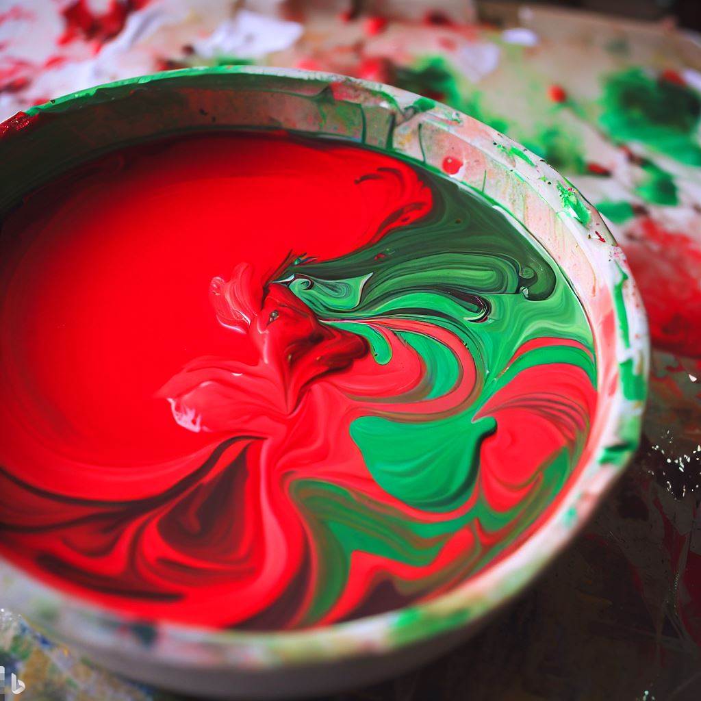
Mixing red and green in the subtractive color model produces a range of colors from various hues of brown to khaki and burgundy, contingent upon the proportions of red and green used and the specific attributes of the pigments. Here are some noteworthy shades that can be generated:
1. Brown: A neutral mixture of red and green, resulting in an earthy, versatile shade. Brown can span from lighter, warmer tints to deeper, cooler ones, hinging on the proportion of red and green used.
2. Khaki: A subdued blend of red and green with more green than red, creating a muted green with a hint of brown. Khaki shades can invoke feelings of nature, stability, and refinement.
3. Burgundy: A more intense and darker blend of red and green, leaning towards red. Burgundy is a lush, warm shade that can stir emotions of passion, elegance, and depth.
Crafting Shades and Subtleties
Various factors influence the final shade and subtlety of the color achieved when blending red and green:
1. Pigment Quality: The pigments’ quality used in paints, markers, or other coloring mediums can impact the resulting shade. Premium pigments usually produce more dynamic and consistent colors.
2. Proportions: The ratio of red to green will affect the final hue. For instance, blending equal parts of red and green will generate a balanced brown, while adding more green will produce a more khaki tint, and increasing the red will result in a more burgundy hue.
3. Transparency: The coloring medium’s transparency can affect the ultimate color. Transparent mediums, like watercolors, can fashion delicate and subdued shades, while opaque mediums, such as acrylic paint or pastels, can yield more vivid and striking colors.
Practical Implementations
Recognizing the array of shades and subtleties attainable by blending red and green can be beneficial in several fields, encompassing art, design, fashion, and home decoration:
1. Art: By experimenting with different proportions of red and green, artists can craft a rich assortment of shades and nuances, adding depth and intricacy to paintings, illustrations, and other creative works, particularly when portraying natural scenes or evoking warmth and depth.
2. Design: Graphic and web designers can employ the full spectrum of colors formed by blending red and green to create visually captivating designs. These shades can serve as background colors, accents, or even typography, eliciting various emotions and forming harmonious color schemes.
3. Fashion: The array of shades generated by blending red and green can be utilized in clothing, accessories, and makeup for an earthy and sophisticated appearance. Different shades can be combined to create a coordinated and fashionable color palette for any outfit, be it casual or formal attire.
4. Home Decoration: Introducing hues of brown, khaki, and burgundy into interior design can establish warm and welcoming spaces. These colors can be applied to wall paint, furniture, textiles, or decorative items to infuse a sense of depth, comfort, and elegance in any space. For example, a burgundy accent wall can impart warmth and sophistication to a room, while khaki upholstery can instill a touch of nature and tranquility. Brown-colored accessories can offer a grounding and neutral element to your home decor.
5. Branding: Businesses can leverage the diverse shades produced by blending red and green in their branding and marketing materials to convey a variety of messages. Brown can communicate stability, reliability, and earthiness, making it fitting for industries such as agriculture, construction, and home furnishings. Khaki can evoke feelings of nature, sustainability, and refinement, ideal for eco-friendly products or high-end brands. Burgundy can symbolize passion, elegance, and depth, which can be suitable for the fashion, wine, or automotive industries.
Conclusion
The fusion of red and green unveils a fascinating spectrum of colors, including brown, khaki, and burgundy, each possessing its unique characteristics and emotional resonance. By comprehending the subtleties and shades achievable through color mixing, artists, designers, and color enthusiasts can unlock new creative possibilities and develop richer, more intricate color palettes in their work. The variety of shades produced by blending red and green provides boundless opportunities for practical applications across art, design, fashion, and home decoration, as well as branding and marketing.