Have you ever noticed how certain colors can instantly lift your mood? The colors of joy and cheerfulness around us can have a powerful effect on how we feel. From the bright yellow of sunshine to the calming blue of a clear sky, colors of happiness influence our emotions in surprising ways.
How colors affect our emotions
Colors do more than just make things look nice. They can change how we feel and think. Research shows that our brains react to different colors in specific ways. The colors of joy and cheerfulness trigger positive emotional responses in our minds.

When we see certain colors, our brain releases different chemicals. Happy colors can boost chemicals like dopamine and serotonin, which make us feel good. This is why interior designers, artists, and marketers pay close attention to color choices.
The science behind colors of happiness
Scientists have studied how colors affect our mood for many years. Color psychology explores the connection between colors and human behavior. Studies show that colors of joy and cheerfulness can:
- Lower stress levels
- Boost energy
- Improve focus
- Enhance creativity
- Create feelings of optimism
Our reaction to colors comes from both personal experiences and cultural influences. While some color responses are universal, others depend on where and how we grew up.
Top colors of joy and cheerfulness
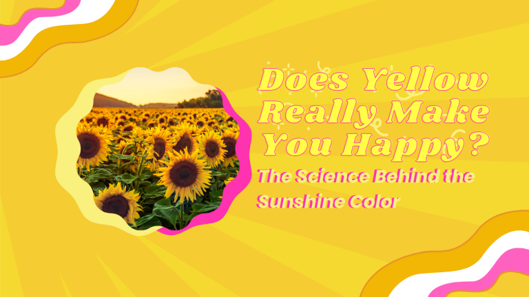
Yellow: The color of sunshine and optimism
Yellow tops the list of colors of happiness. As the color of sunshine, yellow creates feelings of joy, energy, and optimism. It stimulates our mind and makes spaces feel open and welcoming.
A study from the University of Manchester found that yellow can increase confidence and encourage positive thinking. This explains why yellow is often used in kitchens, entryways, and children’s rooms – places where energy and cheerfulness matter most.
-
Sunshine Yellow (Hex: #FFD700): The most energetic and mood-lifting shade of yellow.
-
Cheerful Lemon (Hex: #FFF44F): Bright and stimulating, associated with clarity and focus.
-
Soft Butter (Hex: #FFF8BC): Gentle yellow that promotes calmness and comfort.
-
Golden Yellow (Hex: #FFBF00): Rich and warm, associated with optimism and confidence.
-
Canary Yellow (Hex: #FFEF00): Vibrant and attention-grabbing, energizing shade.
Orange: The energetic blend
Orange combines the energy of red with the happiness of yellow. As one of the key colors of joy and cheerfulness, orange represents enthusiasm, creativity, and warmth.
This vibrant color stimulates activity and encourages communication. It creates a sense of comfort and can even increase appetite. That’s why many restaurants and food companies use orange in their branding.
-
Tangerine Orange (Hex: #FF9933): Energetic and warm, stimulates creativity and enthusiasm.
-
Coral Orange (Hex: #FF7F50): Sociable and friendly, encourages communication and warmth.
-
Peach Orange (Hex: #FFCC99): Gentle and approachable, creates comfort and reduces anxiety.
-
Burnt Orange (Hex: #CC5500): Grounding and confident, promotes stability with energy.
-
Pumpkin Orange (Hex: #FF7518): Vibrant and playful, encourages optimism and sociability.
Designer Emily Henderson says, “Orange brings warmth to any space without overwhelming it. It’s one of my go-to colors of happiness when a room needs energy.”
Blue: Calm happiness
While not as obvious as yellow or orange, blue also ranks high among colors of happiness. Blue creates feelings of calm, trust, and contentment – a different but important type of happiness.
Light blue reminds us of clear skies and peaceful water, creating a sense of open space and possibility. Medium blues promote feelings of trust and stability. Researchers at the University of British Columbia found that blue environments can boost creativity and promote relaxation.
-
Sky Blue (Hex: #87CEEB): Open and peaceful, promotes feelings of possibility and freedom.
-
Serene Azure (Hex: #007FFF): Trustworthy and confident, encourages stability and calm focus.
-
Powder Blue (Hex: #B0E0E6): Gentle and soothing, reduces stress and promotes relaxation.
-
Cornflower Blue (Hex: #6495ED): Uplifting and fresh, balances serenity with positive energy.
-
Ocean Blue (Hex: #0077BE): Deep and reflective, creates feelings of depth and peaceful strength.
Blue works especially well in bedrooms, bathrooms, and offices, where calm focus contributes to happiness.
Green: Nature’s comfort color
Green sits at the center of the color spectrum and requires no eye adjustment, making it naturally restful. As the dominant color in nature, green connects us with the outdoors.
Studies show that green spaces reduce stress and improve mood. Even looking at green plants or images of green landscapes can lower blood pressure and anxiety levels. This makes green one of the most versatile colors of joy and cheerfulness.
-
Spring Green (Hex: #00FF7F): Fresh and revitalizing, symbolizes new beginnings and energy.
-
Sage Green (Hex: #9DC183): Balanced and calming, promotes harmony and stress reduction.
-
Mint Green (Hex: #98FB98): Light and airy, creates feelings of cleanliness and freshness.
-
Forest Green (Hex: #228B22): Grounding and secure, connects to nature and stability.
-
Lime Green (Hex: #32CD32): Energetic and youthful, promotes vitality and enthusiasm.
Interior designers often use green to create balanced, refreshing spaces. Its connection to growth and renewal makes it perfect for areas where you want to feel rejuvenated.
Pink: Sweet joy
Soft pink creates feelings of tenderness, comfort, and nurturing. Originally associated with femininity in Western cultures, pink has become more widely appreciated for its mood-boosting properties.
Baker-Miller Pink, a specific shade of pink, has been shown to temporarily reduce hostile and aggressive behavior. Some sports teams even paint the visiting team’s locker room this color to reduce their opponents’ energy!
-
Baker-Miller Pink (Hex: #FF91AF): Calming and tension-reducing, shown to reduce aggression.
-
Blush Pink (Hex: #FFB6C1): Tender and nurturing, creates feelings of comfort and care.
-
Rose Pink (Hex: #FF66CC): Playful and uplifting, promotes joy and positive energy.
-
Soft Coral (Hex: #F88379): Warm and inviting, balances energy with comfort.
-
Pale Pink (Hex: #FADADD): Subtle and calming, creates gentle, peaceful environments.
Pink combines well with neutrals to create spaces that feel both modern and uplifting. It’s particularly effective in bedrooms and personal spaces where comfort matters.
How to use colors of happiness in your life
You don’t need to repaint your entire home to benefit from colors of joy and cheerfulness. Here are some simple ways to add happy colors to your everyday life:
In your home
- Add yellow throw pillows or artwork to boost energy in living spaces
- Paint an accent wall in a happy color rather than an entire room
- Use green plants to bring nature’s calming effect indoors
- Choose colorful kitchen items like bowls or appliances
- Display blue items in workspaces to promote calm focus
In your wardrobe
- Wear yellow or orange when you need energy or confidence
- Choose blue or green when you need to feel calm but positive
- Add colorful accessories to neutral outfits for a mood boost
- Consider how different colors make you feel personally
In your daily routine
- Use a colorful notebook for journaling or planning
- Choose a phone case or laptop wallpaper in colors of happiness
- Surround your workspace with mood-boosting colors
- Notice which colors improve your mood and seek them out
Combining colors for maximum happiness
Color experts suggest that combinations often work better than single colors. Some uplifting combinations include:
- Yellow and blue: Creates balance between energy and calm
- Green and purple: Connects nature with creativity
- Orange and teal: Provides vibrant contrast that feels modern and happy
- Pink and green: Combines nurturing with growth for a refreshing effect
Conclusion
The colors of joy and cheerfulness offer a simple yet powerful way to improve our mood and wellbeing. Whether through bold yellow walls, calming blue accessories, or energizing orange details, incorporating colors of happiness into our environment can make a real difference in how we feel.
Pay attention to which colors lift your spirits and find small ways to include them in your daily life. By understanding the psychology behind these happy hues, you can create spaces and experiences that boost your mood and enhance your overall wellbeing.
Remember that personal preference matters – the colors that make you happiest might differ from someone else’s. Trust your reactions and surround yourself with the colors that bring you joy.