Blue is elegant, stylish, and chic. Incorporated into your home decor, it can make an amazing addition to any color scheme. Paired with metallic, it will render a luxurious feel to any room. When planning your home decor and design, it is said that you should add at least one blue room to make your home complete. Let’s discover how blue bedrooms can look breathtaking.
1. For some subtle accents
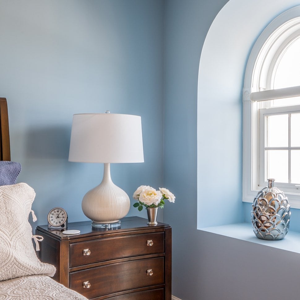
One of the color blue’s great advantages is that it can complement many other shades. Use it as an accent in your bedroom to highlight a piece of dark wood furniture or an array of silver décor pieces. The shade of light blue pictured below flows swiftly around the room to merge with the light white windowsill and brown nightstand. The silver and white décor ties everything together.
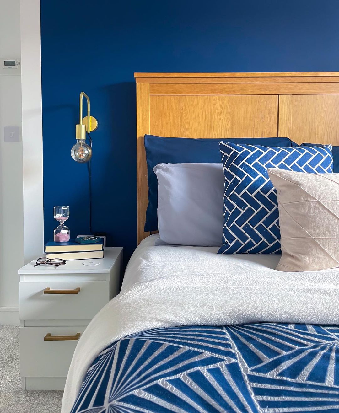
2. For a majestic nook
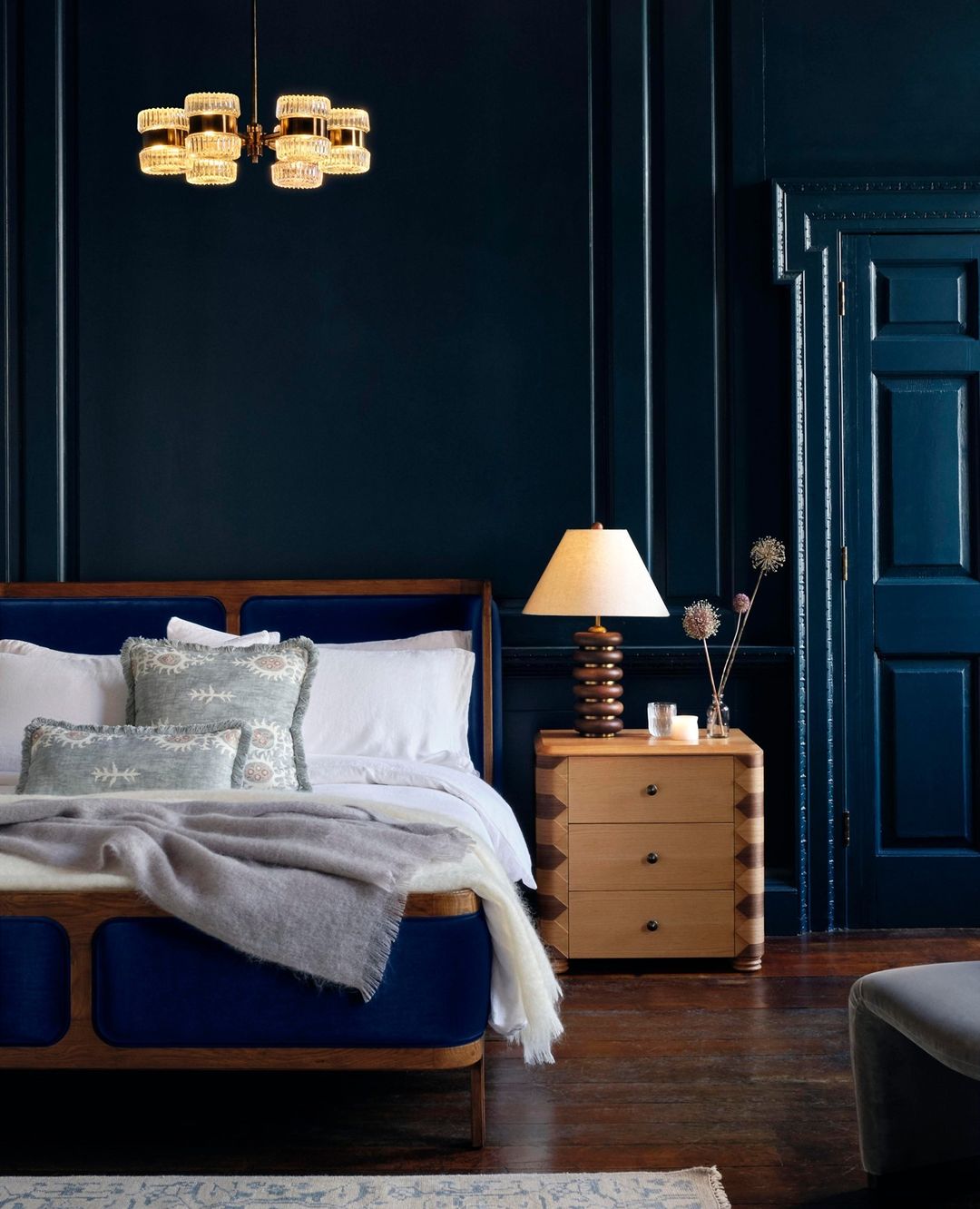
Dark, petrol blue has the power of bringing a hauntingly majestic feel to a room. Paired with luxurious chandeliers and dark wooden floorboards, dark blue can transform any bedroom into a royal hangout. Tip: Paint your door the same color as your wall to help it blend in and further accentuate the feel. The different types of wood here work together in bringing dimension to what could seem like a dark, flat wall.
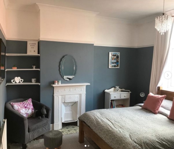
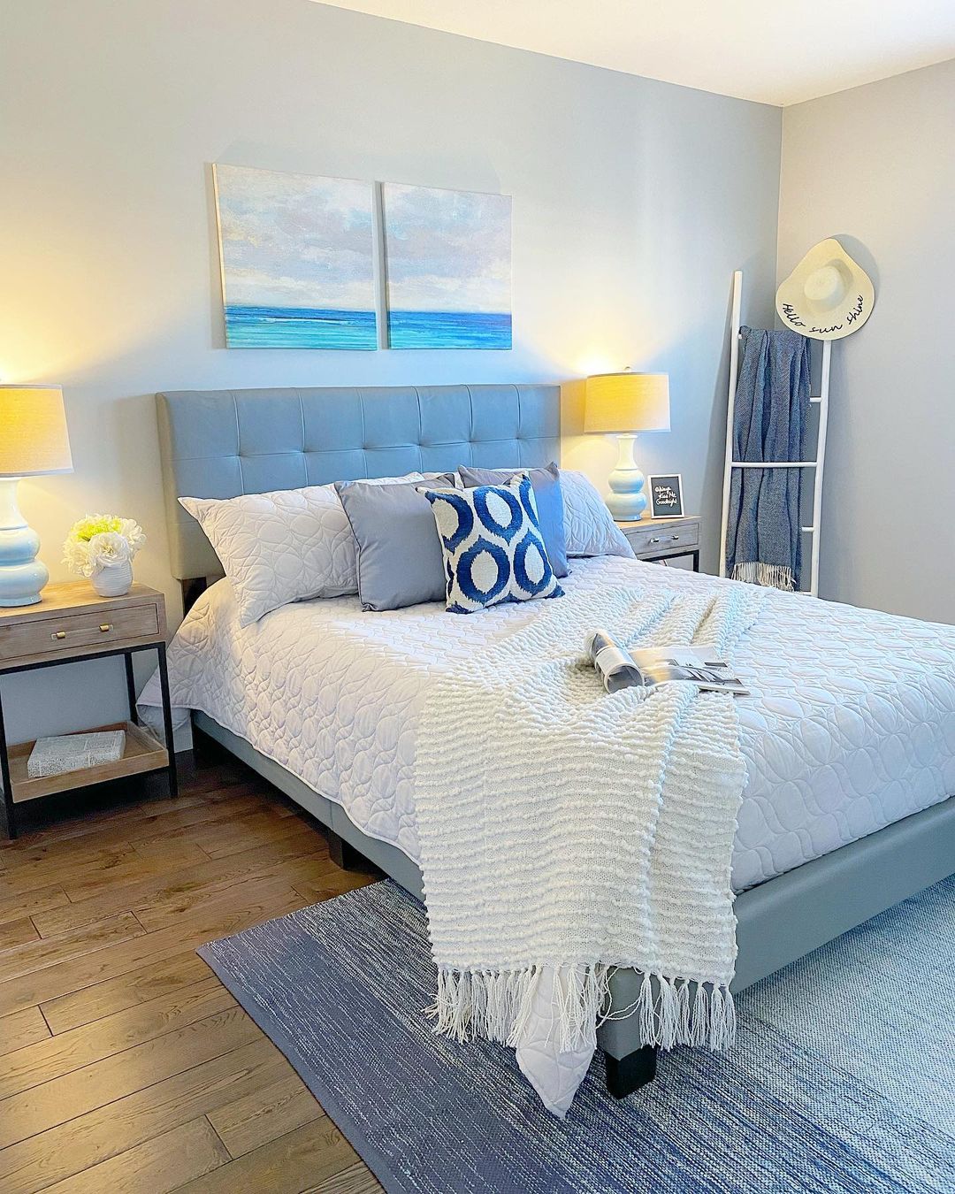
3. For a muted base
Blue can also be discreet. A powdery blue paint can provide a great base for calm, collected and muted decor in your bedroom. Perfect if you don’t like to be overstimulated by the colors in the place where you sleep. Pale pink, white and gray goes perfectly with a light, charcoal blue. Pair with some light drapes, some delicate floral sheets and colorful accent pillows. The small fireplace adds a touch of elegance here.
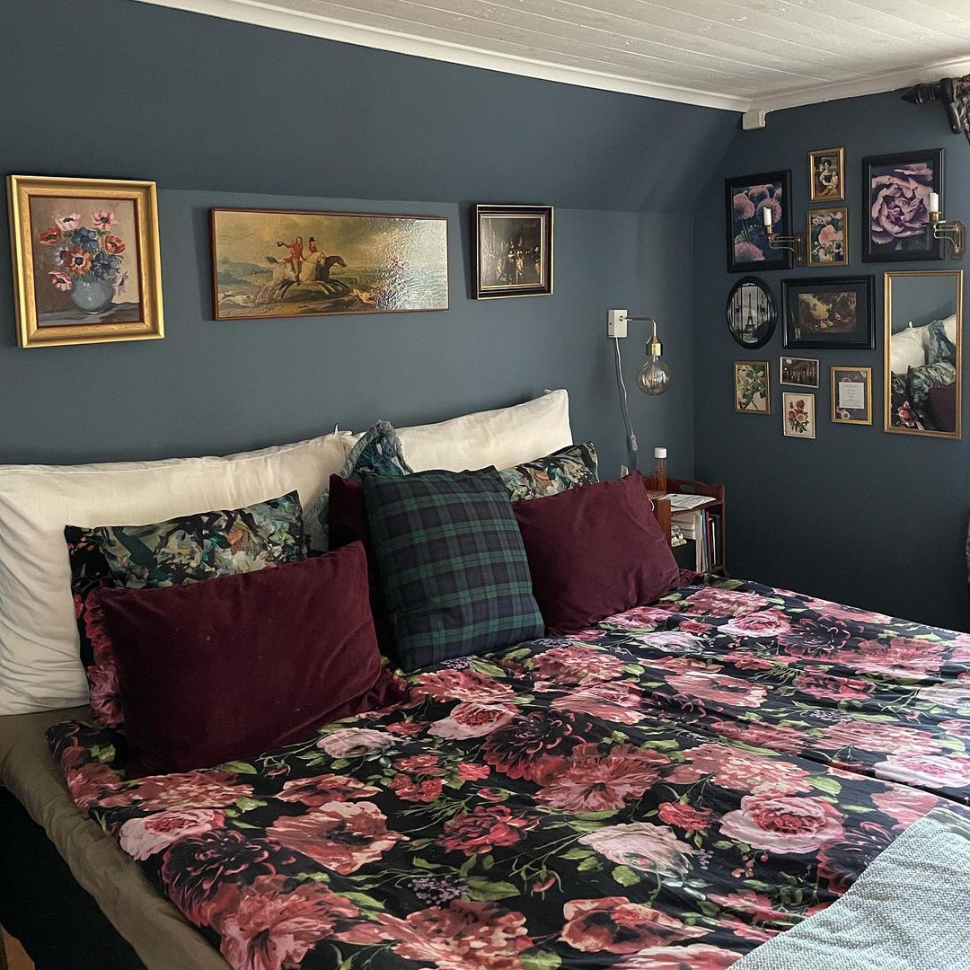
4. Blues, pinks and reds
Blue has been known to complement warmer colors such as reds and pinks. It is a great color to tone down the sometimes aggressive feel that reds and pinks give off. Pair a soft blue wall with some pink floral accents for an overall harmonious look. Here, the big collection of picture frames, many of which depict flowers, recall the busy visual of the sheets and create a harmonious feel to the room. The white ceiling opens it up.
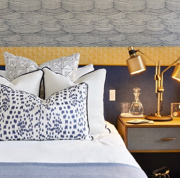
5. Patterned blue and gold
Pair some fun blue patterns with some beautiful and elegant gold accents, for an eye-catching bedroom. This stylish combination will bring brightness and sass to your walls. Don’t hesitate to combine many different patterns, they’ll look great as long as you keep to a similar shade of blue across all the various patterns. The bedroom pictured here is a great example of mix and match patterns that perfectly collide with the bright gold lampshades, headboard, and nightstand.
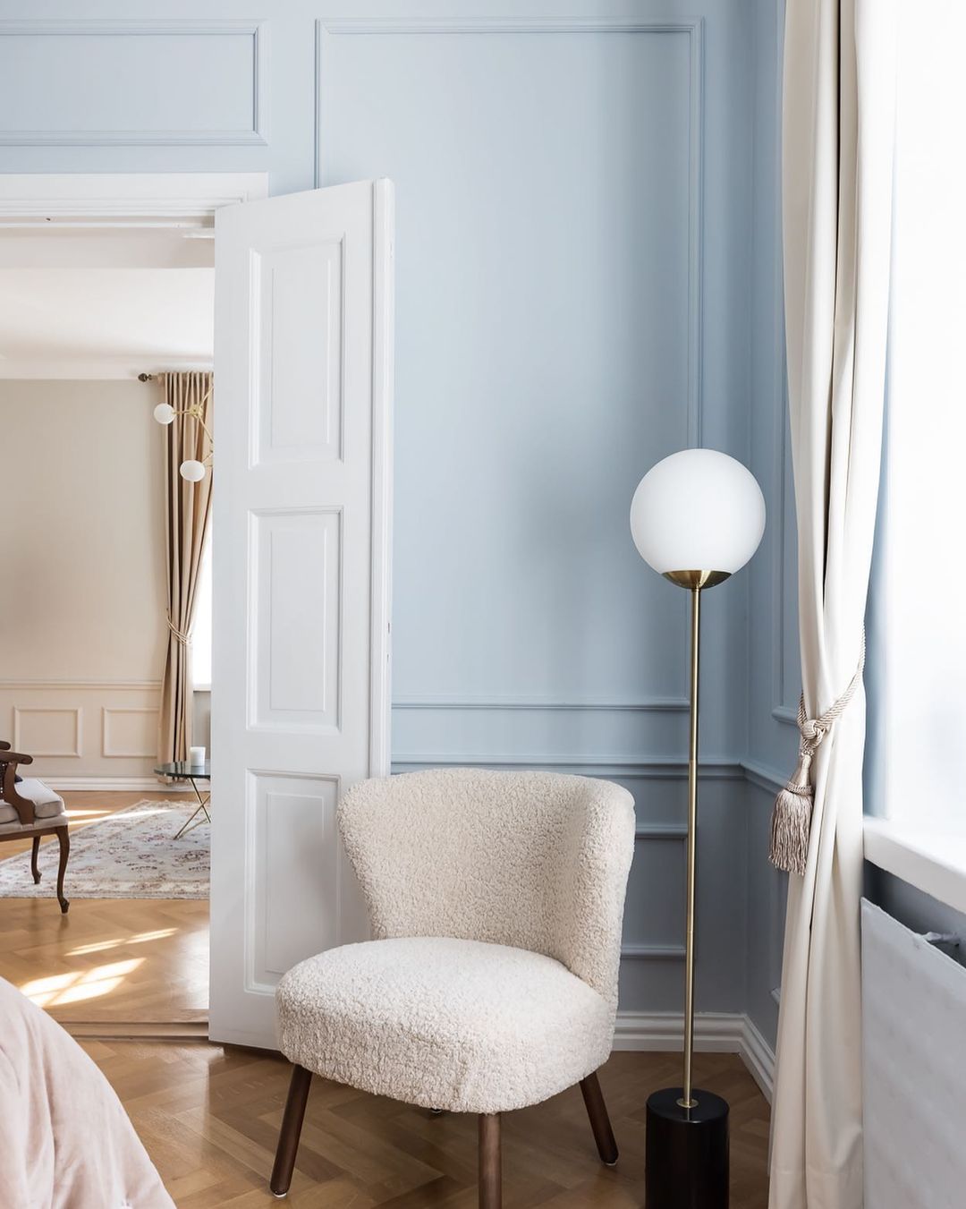
6. Light blue and light wood
If you have light wooden flooring, a great option is for you to paint your walls a very light blue, to create an airy and dreamy bedroom. This is a great option if you are somewhat of a minimalist and don’t own much furniture. Your bedroom will look like it is perched high up in the clouds! Pair with thick, flowing curtains, and wide, vintage Persian rugs to add depth and dimension to the room.
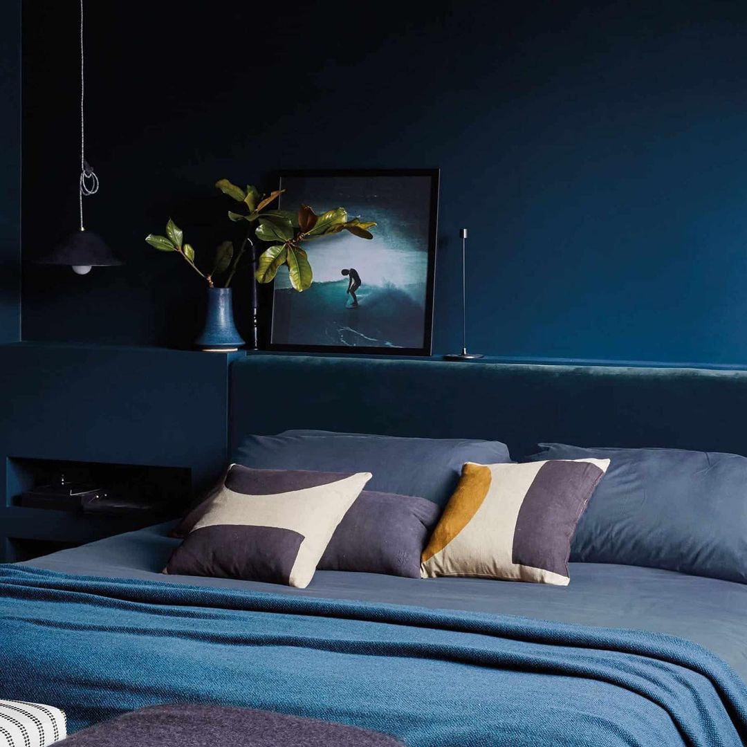
7. Moody blues
If you want a bedroom with a striking, “can’t look away” kind of feel to it, try this deep dark blue paint and pair it with a blue velvet headboard. The light seems to reflect in such a mystical way onto the deep blue wall, creating waves of color and darkness across the surface. Add a pop of color like an orange accent pillow or yellow bedding to create a striking contrast.
8. Different shades of blue
If you like, you can choose many different complementary shades of blue and combine them to create a wonderful mish-mash of blue in your bedroom. Anything from very dark blue to pale, near-white blue can go together. You’ll feel like you’re staring at ocean waves, from the light foam to the dark depths of the water.
9. Geometrical blue
Use patterns and lines to create a pleasant construction of geometrical constructions. A beautiful blue color will soften the sometimes stern look geometrical patterns can have. You can paint a background solid blue, then take that same blue color and look for accent pillows, sheets, throws, and duvet covers. You can even go into much detail by coordinating the blue with the color of your bedside table books!
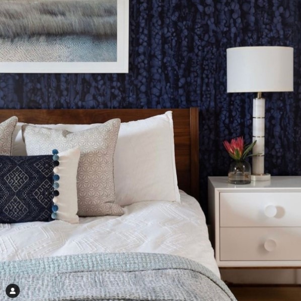
10. Blue Wallpaper
If you find the color blue a bit too plain, you can spice things up by covering your walls with wallpaper. There are many great options for wallpaper, especially for blue wallpaper that is one of the most popular colors! This type of dark blue wallpaper contrasts amazingly with different types of dark wood, such as mahogany, for example. The white elements to this room add a welcome contrast to the darkness of the wall and the wood, though some blue is repeated on the accent pillow placed on the bed.
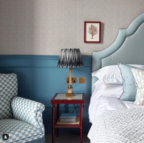
11. Blue panels and neutral wallpaper
You can also play with contrast by adding panels to the bottom half of your walls and painting them a deep shade of blue. Here, the textured wallpaper really spices up the cool blue shade. The addition of other variations of blue with the patterned armchair and beautiful textile headboard add even more depth to the room. What ties everything together is the deep red lacing on the headboard and pillow, wonderfully coordinated with the small picture frame on the wall and the bedside table. All colors seem to echo into each other to create a masterpiece!
We have seen many examples of using the color blue in the walls of your bedroom. There are ideas for any taste, ranging from discreet light blues to impressive and majestic dark petrol blues. You don’t have to implement the color blue on every wall of your bedroom – find your own balance maybe by painting some boards or paneling blue, and the rest white, or wallpaper.