Certain colors in the ever-evolving world of design, fashion, and aesthetics transcend fleeting trends to acquire classic status. Charcoal brown is one such elegant color—a suave neutral that incorporates the darkness and privacy of charcoal and the rich warmth of brown. This intriguing color occupies a unique position in the color spectrum, offering designers and connoisseurs a versatile option that simultaneously speaks of power and understatement. As we explore the nuances of charcoal brown color, we discover not only a color but a statement that bridges several design languages and serves as a canvas for a multitude of aesthetic meanings.
What Color is Charcoal Brown? Defining the Undefinable
Charcoal brown is where charcoal and brown meet at the interesting intersection of the two. Charcoal gives it gravity and richness with its darkened gray hue that sends us imagining charred wood, yet charcoal brown also invites the terra cotta warmth of the brown. The result is a color that cannot be simply described—too warm to be strictly charcoal, yet too dark and smoky to be an ordinary brown.
Technically, charcoal brown is typically extremely dark brown with gray undertones, or, on the other hand, warm-biased charcoal with brown admixtures. Its RGB will be around 44-38-28, so the red (the primary component of brown) is ever so slightly greater than the green, and blue (which would move it into cooler latitudes) in the slightest measure. The hex code is close to #2C2619, although it does change with the specific version of the color.
-
Deep Charcoal Brown (Hex: #3B302A): A rich, dark variation with warm undertones and exceptional depth.
-
Mocha Charcoal (Hex: #483C32): A sophisticated blend of brown and gray with earthy, grounding qualities.
-
Smoked Umber (Hex: #4A3C30): A balanced fusion of deep brown and ashen gray with natural elegance.
-
Espresso Char (Hex: #352C27): A profound, coffee-inspired shade with smoky undertones and subtle warmth.
-
Burnt Timber (Hex: #43342E): A nuanced, wood-inspired color with warm, rustic character and smoky depth.
The Historical Journey of Charcoal Brown
Though never necessarily technically defined as that, charcoal brown has been key to design’s past. There is a means of tracing charcoal brown back into nature, such that wood after it has burnt and certain minerals show this resultant color. Those early civilizations took the same terrestrial pigments formulated around manganese and iron oxides and applied them to everything ranging from cave murals to rituals decorations.
Over the course of the Industrial Revolution, as technology increasingly enabled more refined synthetic pigments, more homogeneous batches of smoky dark browns were developed for use in manufacturing. Dark-stained woods and highly coloured fabrics, commonly used in furnishings during the Victorian period, suggested prosperity and depth.
The Psychological Impact of Charcoal Brown Color
Colors have powerful influences on human psychology, and charcoal brown has particularly rich psychological meaning. The color conveys stability, reliability, and solidity from the earth and wood connotations. At the same time, it conveys sophistication and mystery with its charcoal component, providing depth and intensity.
Charcoal brown spaces are generally perceived as safe and heavy. The color creates a feeling of shelter and solidity, particularly in spaces that are to be used for concentration, contemplation, or quiet discussion. Unlike pure black, which may at times be oppressive, charcoal brown gives depth without weight, encircling rather than stifling.
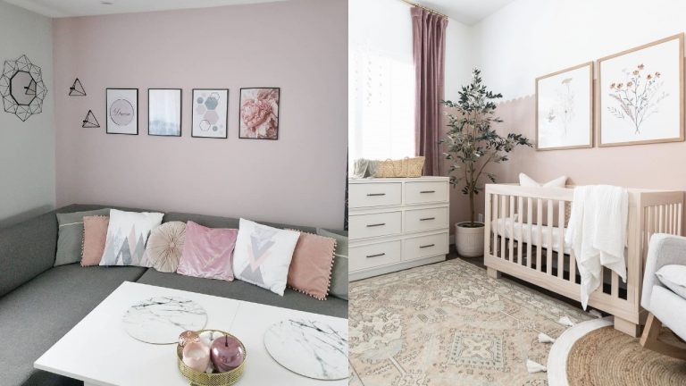
Charcoal Brown in Interior Design: Creating Depth and Warmth
Interior designers have become enamored with charcoal brown for its great capacity to create spaces that are both sophisticated and welcoming. While cooler dark neutrals can, at times, feel stern, charcoal brown brings warmth to rooms without losing an air of sophistication.
Applied to walls, charcoal brown creates a wrapping space that seemingly causes rooms to be more intimate and gives the space the illusion of added depth. This seemingly opposite effect makes it particularly helpful in dining rooms, libraries, and other spaces where creating a sense of focused connection is best. Charcoal brown takes light rather than bouncing it back, creating soft shadows that add dimension and interest.
Charcoal brown flooring—wood, stone, or fabric—offers a strong base that supports almost any design direction laid upon it. The color’s neutrality allows it to recede when needed, but its depth keeps it from ever being flat or lifeless. That flexibility is why charcoal brown hardwood flooring and tiles have been a steady favorite even in the face of changing design trends.
Fashion Applications: The Sophisticated Alternative to Black
Charcoal brown has become the sophisticated replacement for simple black in the world of fashion. It offers the same formality and slimming effect but with a bit more interest and depth. This makes it particularly beneficial for high-end basics and investment pieces designed to withstand seasonal style.
Charcoal brown outerwear—fitted wool coats or leather jackets—is both timeless and distinctive. The color complements bold accent colors as much as other neutrals, which makes it a great anchor piece for capsule wardrobes. Its warm subtlety also makes it flattering with a wider range of skin tones than pure black or charcoal gray, which can be too cool-toned for warmer complexions.
Accessories in charcoal brown, particularly leather accessories like bags, belts, and shoes, develop a deep patina with age that makes them more lovely rather than less so. This patina is ideally suited to present interest in investment pieces that become increasingly lovely with wear, counteracting the disposability that characterizes fast fashion.
Complementary Colors: Creating Palettes Around Charcoal Brown
One of the greatest qualities of charcoal brown is how well it is compatible with a broad array of color schemes. Being so neutral, it can be used as a base or an accent color and mold itself in various directions of aesthetics without sacrificing any personality.
Paired with cream, ivory, and beige, charcoal brown creates a refined, low-contrast color scheme that is calm and elegant. It is particularly well-suited for traditional and transitional interior design styles, where quiet refinement is more appealing than contrasty drama.
When paired with jewel colors such as emerald green, sapphire blue, or amethyst purple, charcoal brown permits these brighter colors to take center stage while grounding them in earthiness. This keeps jewel-toned color schemes from being too precious or theatrical, rather giving them a sophisticated earthiness.
Metallics like brushed brass, copper, and bronze also resonate particularly well with charcoal brown, warming it and adding light reflection and depth. It has been a highly popular combination in contemporary interior design, where contrast between matte darkness and metallic glow creates dramatic visual tension.
-
Warm Ivory (Hex: #F8F0E3): Creates a refined, low-contrast scheme that is calm and elegantly traditional.
-
Emerald Green (Hex: #046307): Allows this jewel tone to take center stage while charcoal brown grounds it with sophisticated earthiness.
-
Sage Green (Hex: #B2AC88): Creates a contemporary application that appears both new and timeless, fusing different design languages.
-
Brushed Brass (Hex: #D4B76A): Warms charcoal brown while adding light reflection and depth for dramatic visual tension.
-
Amethyst Purple (Hex: #9966CC): Provides a rich jewel tone that charcoal brown keeps from becoming too theatrical or precious.
Conclusion: The Enduring Appeal of Complex Neutrals
Against a design context in most instances defined by either severe minimalism or dense color declarations, charcoal brown is a compelling middle ground. Its weight invites scrutiny, with different facets appearing under changing conditions and contexts. This depth makes environments and objects defined by the color fascinating even after long stretches of time, rewarding each successive interaction instead of producing a one-time, first impression.
As today’s aesthetics place ever greater emphasis on authenticity, sustainability, and affinity with natural products, charcoal brown’s ability to recall earth, wood, and stone makes it well poised to resonate with these cultural forces. By both communicating and conveying elegance and earthiness simultaneously, charcoal brown speaks to customers who want products and spaces that bridge sophistication and approachability.