Ever wondered about that perfect neutral shade that designers keep mentioning? The pronunciation of the color taupe often leaves people tongue-tied, even though it’s everywhere from fashion runways, home decor magazines and popular paint color palettes. Let’s clear up how to say this tricky color name and explore why this blend of brown and gray has become such a popular neutral color.
What is Taupe?
The color taupe is celebrated for its versatility and subtle sophistication, finding its place as one of the most adaptable neutrals in modern color palettes. Technically, taupe sits between brown and gray on the color wheel, which gives it a unique ability to unify both warm and cool schemes. It is often classified among brownish grays, and the name itself derives from the French word “talpa,” meaning mole—a nod to its earthy, grounded nature and connection to the neutral shades found in the natural world.
If you’re curious about how taupe is constructed, the easiest way to understand it is by looking at its color values. For a classic taupe (Hex: #483C32), the CMYK values are C: 0%, M: 17%, Y: 31%, K: 72%, with RGB values of R: 72, G: 60, B: 50. These proportions create a shade of taupe that delivers depth and stability, with its elevated black value lending an anchoring presence. Lighter shades of taupe, which are popular in leisure and interior design, feature less saturation, like C: 0%, M: 4%, Y: 2%, K: 45% and RGB: 140, 134, 127, resulting in a softer, more calming effect. Taupe’s ability to adjust saturation and depth means it can range from pale, almost beige tones to darker shades bordering on charcoal, giving designers a broad spectrum to work with.

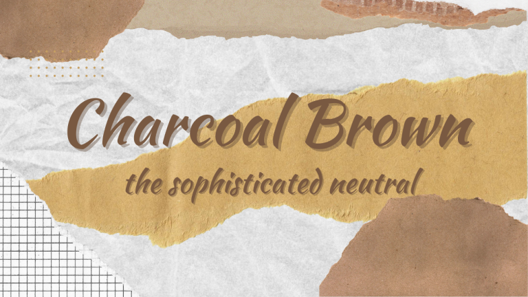
In home decor and interior design, taupe is more than just a neutral color. Its understated elegance and feelings of calmness lend comfort and composure to any setting. Whether an accent wall or a cozy sofa, the color taupe offers a backdrop that blends effortlessly with similar colors like mole or even deeper neutrals such as charcoal. This makes it a go-to for anyone planning their next design or ad campaign, especially when aiming for sophistication without overwhelming the senses.
Taupe, as part of modern color palettes, shines in both minimalist and richly layered interiors. Its role as a neutral color means it complements a wide array of accent hues, from bold jewel tones to soft pastels, while still standing out on its own. Taupe’s composure and stability create an environment of elegance and leisure, and its versatility ensures it never fades from style. For anyone seeking comfort and depth in their space, taupe’s blend of modern appeal and timeless neutrality makes it a smart choice for the long haul.
Where Did the Word “Taupe” Come From?
The name has French roots, coming from the word for the European mole (Talpa europaea). The color was inspired by the animal’s grayish-brown fur. Understanding this background helps explain why English speakers often struggle with the pronunciation.
According to color psychology experts, the brown and gray combination in taupe creates a grounding effect that explains why it’s so calming in home environments. The neutral shade works in both traditional and modern design approaches.
Common Ways People Mispronounce Taupe
Even design professionals sometimes get it wrong! Here are the most common mistakes:
Mistake #1: Saying “Towp” (Like “Cow”)
Many people say “towp” with an “ow” sound like in “cow” or “how.” This happens because the “au” spelling trips up English speakers who think of words like “haul” or “fault.”
Mistake #2: Saying “Tawp” (Like “Jaw”)
Others use an “aw” sound, saying “tawp” like in “saw” or “jaw.” While English has plenty of “au” words pronounced this way (like “caught”), it’s not right for taupe.
Mistake #3: Overstretching the Vowel
Some people nail the vowel sound but stretch it out too much, making it sound overly formal or affected. This misses the quick, natural way the word should flow.
How to Say Taupe Correctly
The right pronunciation is /toʊp/, rhyming with “hope” – but with a shorter, quicker “o” sound. Think of saying “hope” without dragging out the vowel, then replace the “h” with “t.”
A good trick is to practice saying “toe” + “p” quickly together. The sound should be crisp and clean, not drawn out. As language experts explain, borrowed French words often keep hints of their original sound patterns.
The word “taupe” is phonetically written as /toʊp/ in American English and /təʊp/ in British English, showing the specific sounds of the vowels and consonants. Using phonetic transcription ensures that people can pronounce words accurately, regardless of their native language.
English borrows words from everywhere, and pronunciation rules don’t always follow consistent patterns. With “taupe,” the French origin meets English spelling conventions, creating confusion.
The “au” combination is especially tricky because it sounds different in various English words:
- “Haunt” (with an “ah” sound)
- “Gauge” (with an “ay” sound)
- “Author” (with an “aw” sound)
No wonder people hesitate when describing their neutral shade paint colors!
Easy Ways to Perfect Your Pronunciation
Want to sound like a design pro? Try these simple tips:
- Listen to audio guides: Online dictionaries often have pronunciation clips.
- Practice the quick “hope” trick: Say “hope” but replace the “h” with “t” and keep it short.
- Record yourself: Compare your pronunciation to reference audio.
- Use it in sentences: “The living room walls are painted in a warm taupe.”
- Watch design shows: Hearing professionals use the term helps it stick.
Many interior designers recommend practicing color terminology if you’re planning a home makeover project.
Other Names for This Popular Brown and Gray Blend
Not comfortable saying taupe yet? These alternatives work perfectly:
- Greige (gray + beige)
- Warm gray
- Soft brown
- Mushroom
- Stone
- Putty
- Cappuccino
- Driftwood
- Neutral tan
These options help when discussing color schemes for living spaces with painters or designers.
Why Getting It Right Matters
Knowing how to pronounce design terms correctly makes a difference when:
- Working with interior designers
- Shopping for paint or furniture
- Discussing fashion trends
- Planning color schemes
- Impressing at design-focused social events
As communication experts note, using industry terminology correctly boosts your credibility instantly. Plus, you’ll avoid those awkward moments when someone corrects your pronunciation.
Taupe in Today’s Design World
This sophisticated neutral has become increasingly popular in both fashion and home design. According to recent color trend reports, taupe is seeing a major comeback as people move away from stark grays toward warmer neutrals.
Designers are pairing taupe with everything from jewel tones to pastels. Its versatility explains why paint companies keep expanding their brown and gray blended collections each year.
Real-World Uses for Taupe
This adaptable neutral shade works everywhere:
- Walls: Creates a sophisticated backdrop that doesn’t compete with artwork
- Furniture: Hides everyday wear while staying stylish
- Fashion: Works as a year-round neutral for wardrobes
- Accessories: Adds warmth without overwhelming other colors
- Exteriors: Provides timeless appeal that complements landscapes
Many design bloggers recommend taupe for people who want a finished look that won’t quickly feel dated.
Final Thoughts
Now that you know taupe is pronounced like a quick version of “hope” with a “t,” you can confidently use this sophisticated term in your next color conversation. Whether you’re redecorating your home, discussing fashion, or just impressing friends with your design knowledge, pronouncing taupe correctly adds to your style credibility.
With its perfect balance of warm brown and cool gray undertones, taupe deserves to be in your regular vocabulary. So go ahead—use this versatile neutral shade with confidence, both in your design choices and in conversation!
But remember, language is always evolving, and regional differences may affect how people pronounce color names. What matters most is clear communication. If you’re in a design meeting and someone uses a different pronunciation, focus on the color itself rather than getting caught up in correction.
The beauty of taupe lies in its ability to bridge worlds—it’s neither fully brown nor completely gray, but something uniquely in between. This quality makes it endlessly useful in design. As color theorists have noted, neutral shades like taupe create psychological comfort because they remind us of natural elements like stone, wood, and earth.
Looking ahead, design forecasters predict that taupe and other sophisticated neutrals will continue gaining popularity as people seek calming, timeless environments. The pandemic has reinforced our desire for soothing spaces, and few colors deliver this feeling better than taupe’s gentle brown and gray blend.
Whether you’re painting an accent wall, choosing a sofa, or selecting a new coat, taupe offers that rare combination of practicality and elegance. It hides stains better than lighter neutrals while creating more warmth than cooler grays. Now that you can pronounce it properly, you’re ready to embrace all the possibilities this versatile color brings to your home and wardrobe!


This lifted my spirits
very informative articles or reviews at this time.