Colors play an essential role in our lives, from evoking emotions and shaping our perceptions to driving our decisions. Mixing colors opens up a world of possibilities, and understanding the science and art of color mixing is crucial for artists, designers, and color enthusiasts. In this article, we will delve deeper into the process of mixing blue and green, focusing on the range of shades and nuances that can be achieved, as well as their practical applications.

The Science of Color Mixing
As mentioned in previous articles, color mixing can be classified into two models: the additive and subtractive color models. In this article, we will concentrate on the subtractive color model, which is used in traditional mediums like painting, printing, and photography.
The Resulting Color Spectrum: Shades of Turquoise, Teal, and Aqua
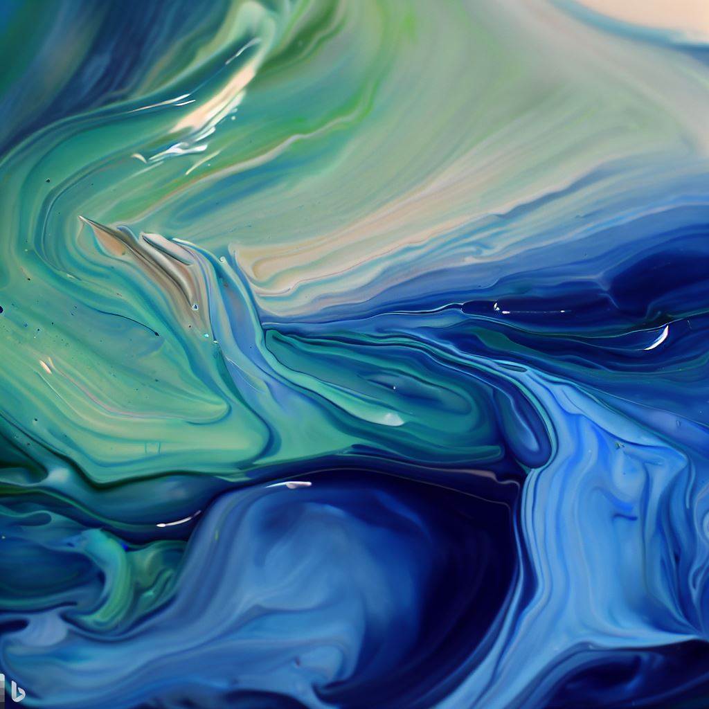
Mixing blue and green in the subtractive color model doesn’t yield just one color; instead, it creates a spectrum of colors that fall between blue and green on the color wheel. The specific hue and shade produced depend on the proportions of blue and green used, as well as the pigments’ characteristics. Here are some notable shades that can be created:
- Turquoise: A blend of blue and green with more green than blue, reminiscent of the color of the turquoise gemstone. It’s a captivating and soothing shade often associated with tropical waters.
- Teal: A darker, more balanced mix of blue and green, leaning slightly towards blue. It’s a rich, sophisticated shade that can evoke feelings of depth and stability.
- Aqua: A lighter, more pastel blend of blue and green, with a higher proportion of blue. It’s a refreshing, airy shade that can bring to mind clear skies and the freshness of water.
Creating Shades and Nuances
Several factors influence the final shade and nuance of the color obtained when mixing blue and green:
- Pigment Quality: The quality of the pigments used in paints, markers, or other coloring mediums can affect the resulting shade. High-quality pigments typically produce more vibrant and consistent colors.
- Proportions: The ratio of blue to green will impact the final shade. For example, mixing equal parts of blue and green will create a balanced teal, while adding more green will result in a more turquoise hue, and adding more blue will yield a more aqua shade.https://www.colorpsychology.org/blue/
- Transparency: The transparency of the coloring medium can influence the final color. Transparent mediums, like watercolors, can create delicate and subtle shades, while opaque mediums, like acrylic paint or pastels, can produce more vivid and intense colors.
Practical Applications
Understanding the range of shades and nuances that can be achieved by mixing blue and green can be helpful in various fields, including art, design, fashion, and home decoration:
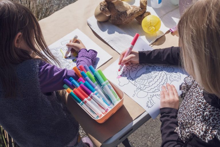
- Art: Artists can create a rich array of shades and depths by experimenting with different proportions of blue and green. This can add a sense of dimension and complexity to paintings, illustrations, and other artworks.
- Design: Graphic and web designers can use the full spectrum of colors created by mixing blue and green to create visually appealing designs. These shades can be used for background colors, accents, or even typography to evoke different emotions and create harmonious color schemes.
- Fashion: The range of shades created by mixing blue and green can be used in clothing, accessories, and makeup for a refreshing and soothing look. Different shades can be combined to create a cohesive and stylish color palette in any outfit.
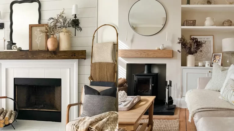
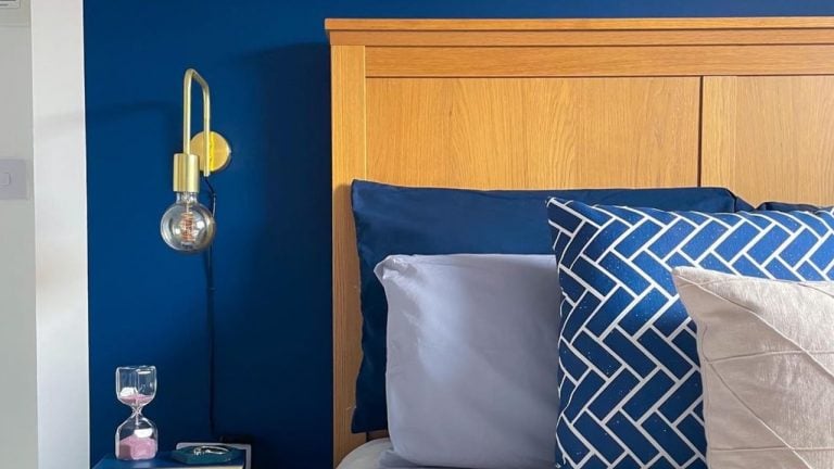
- Home Decoration: Incorporating shades of turquoise, teal, and aqua into interior design can create calming and invigorating spaces. These colors can be used in wall paint, furniture, textiles, or decorative items to bring a sense of tranquility and freshness to any space. For instance, a turquoise accent wall can energize a room, while teal upholstery can add sophistication and depth. Aqua-colored accessories can provide a light and airy touch to your home decor.
- Branding: Companies can use the different shades produced by mixing blue and green in their branding and marketing materials to communicate a variety of messages. Turquoise can convey calmness, trust, and reliability, making it suitable for wellness, travel, and technology industries. Teal can evoke feelings of stability and sophistication, ideal for financial services or luxury brands. Aqua can represent freshness and innovation, which can be fitting for creative agencies, startups, or environmentally conscious businesses.
Conclusion
Mixing blue and green yields a fascinating spectrum of colors, including turquoise, teal, and aqua, each with its own unique characteristics and emotional impact. By understanding the nuances and shades that can be created through color mixing, artists, designers, and color enthusiasts can unlock new creative possibilities and develop richer, more complex color palettes in their work. The range of shades produced by mixing blue and green offers endless opportunities for practical applications across art, design, fashion, and home decoration, as well as branding and marketing.