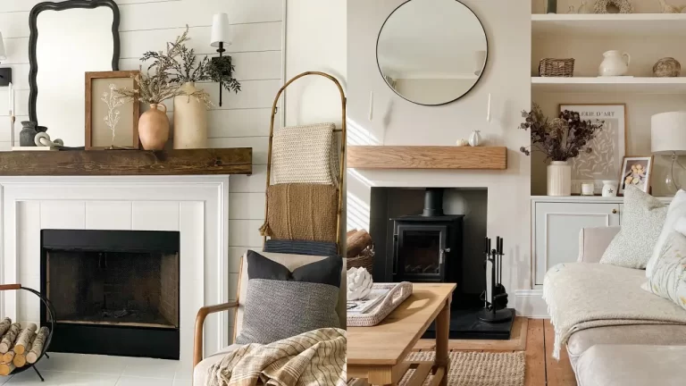
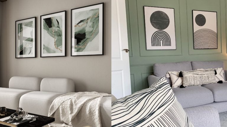
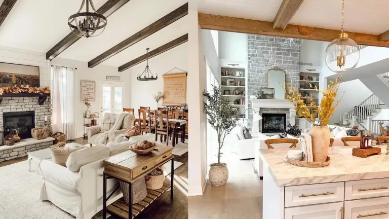
Different areas of the house have different purposes. As the name may suggest, the living room is where much of the living takes place. For this reason, cultivating a special space where you feel comfortable and at home is essential to one’s wellbeing. Much time is spent in this room, and therefore good thought should be put into the space.
A space is just a space, but what personalizes it, and makes it your personal space, is decoration and personal touches. It is important to customize the area to your taste to feel at home. Amongst all decorative features, color has an important impact on human emotion and feelings. Even scientists have explored how different colors create different atmospheres and affect mental states.
Choosing the right color for your living room is a big step in making the living room the ideal space. The color can make or break the space, and ultimately is what brings the room together. Below are different color suggestions which explore the diverse possibilities that may be perfect for you.
White
A classic, and with good reason. This timeless, trendless approach can never go wrong. White guarantees a peaceful environment, and is versatile if you choose to change decoration. A plus if the walls are textured!
Beige
This is a neutral that can’t go wrong. Beige creates a serene feel that ensures a warm and welcoming space.
Baby blue
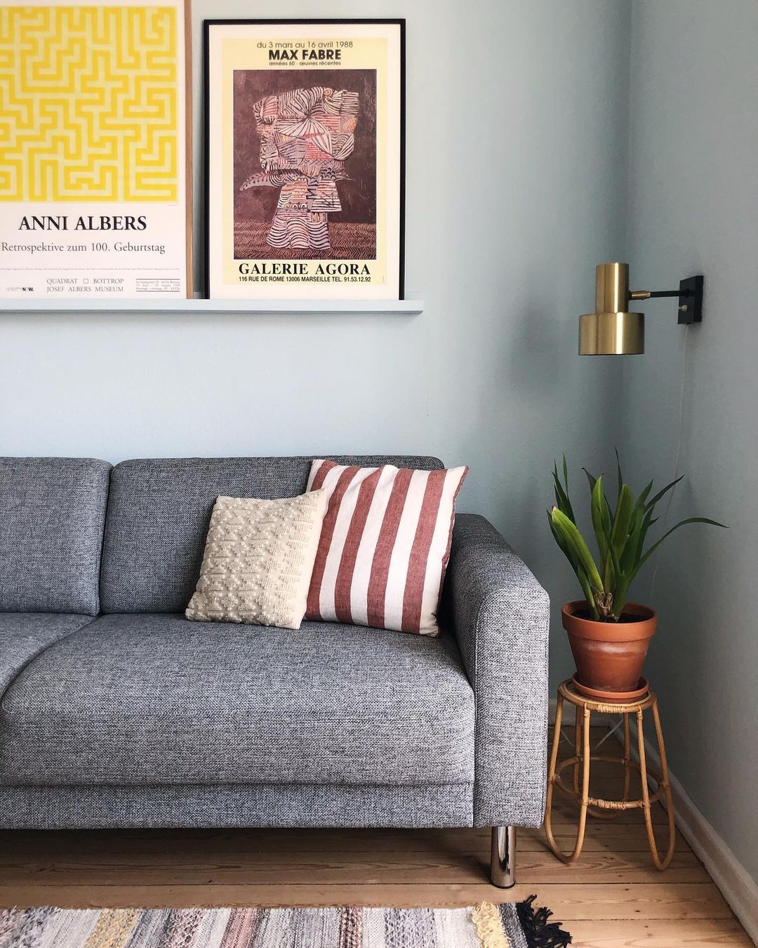
This choice is a fun way to color your space all why maintaining a peaceful feel. Baby blue is the perfect balance between a color pop and a relaxing feeling. This color also is sure to evoke an ethereal, celestial vibe to your space which will leave you feeling appeased and wholesome.
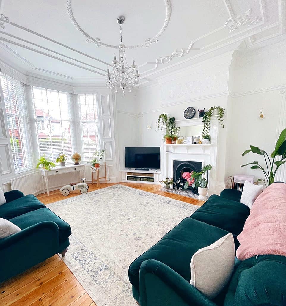
Musky Green
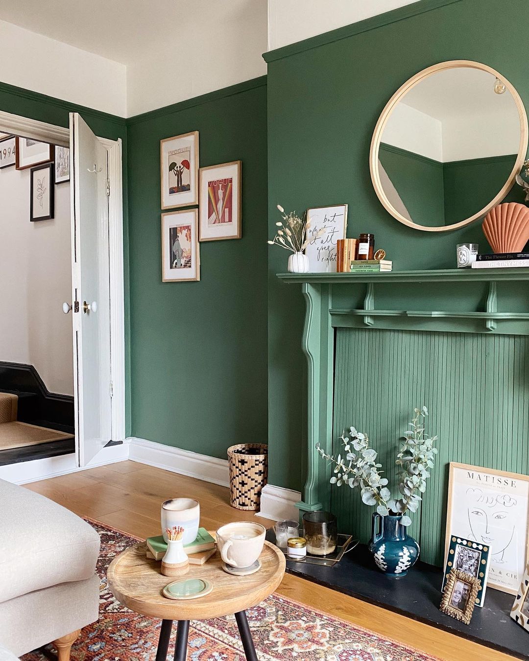
While plants are a wonderful addition to a living space, they require much maintenance. Opt for a musky green wall if you desire this natural, jungle feel while keeping it simple.
Pale Auburn
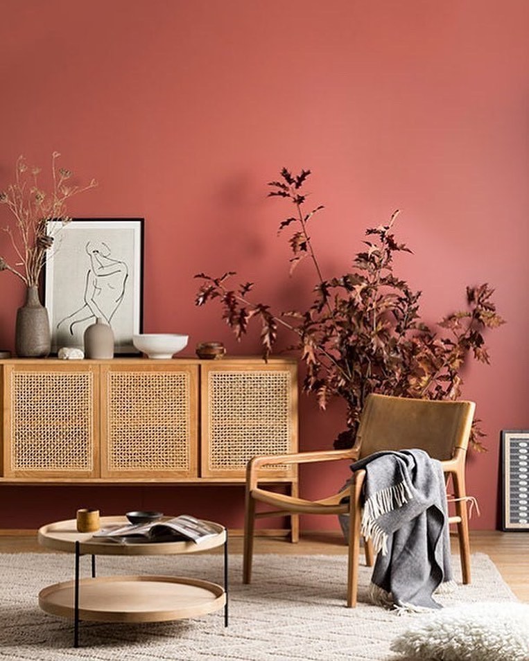
This original color option will work as decoration in itself. A pale auburn will create a dessert-y feel that will keep the space warm without overpowering. It is also light enough that creates space.
Mint
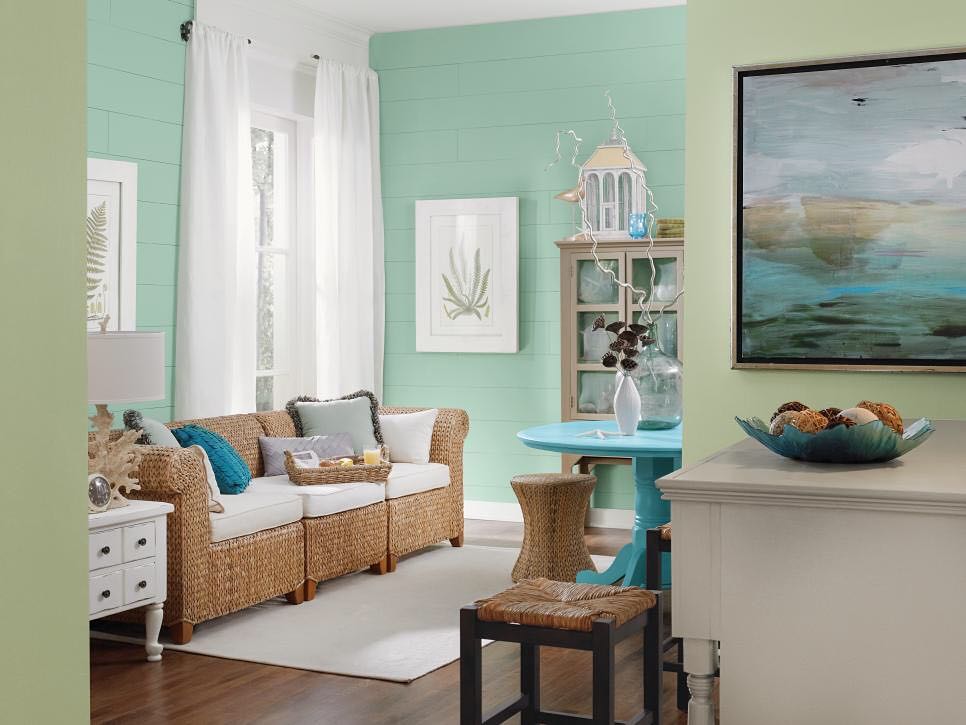
A mint wall is a good way to bring light and youth into the space. This color will create a pop that will keep the space dynamic all while having a playful feel. Mint is a good option to use on one wall, and let the rest of the room speak for itself.
Deep Red
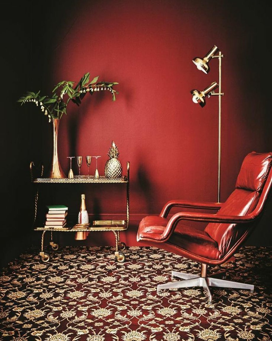
Another classic, a red room is guaranteed to leave an impression. Red walls immediately set the tone to a warm, familiar and intimate space. This is an ideal color if you live in a cold environment.
True Orange
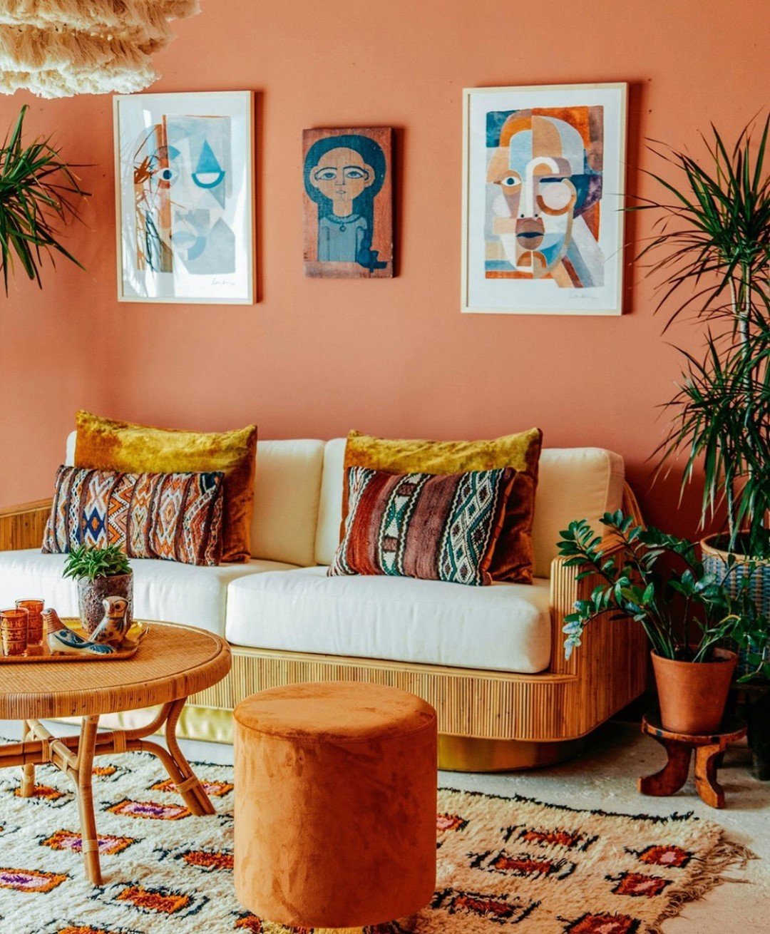
There is perhaps no better way to create a tropical feel than painting your walls orange. This color will immediately evoke a vacation and tropical feel. It is promised to brighten up your day without being too intense or out of place.
Dark Purple
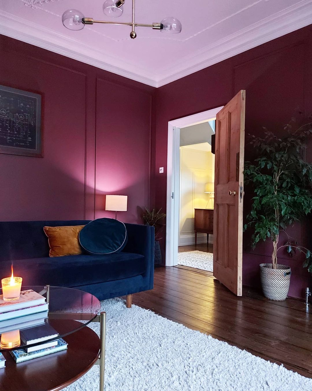
Feeling like using something original but that still works with decoration and other colors? An option that will make you feel safe but also sexy? Try dark purple! This color will be sure to impress your guests and also make you feel seductive and creative.
Lilac
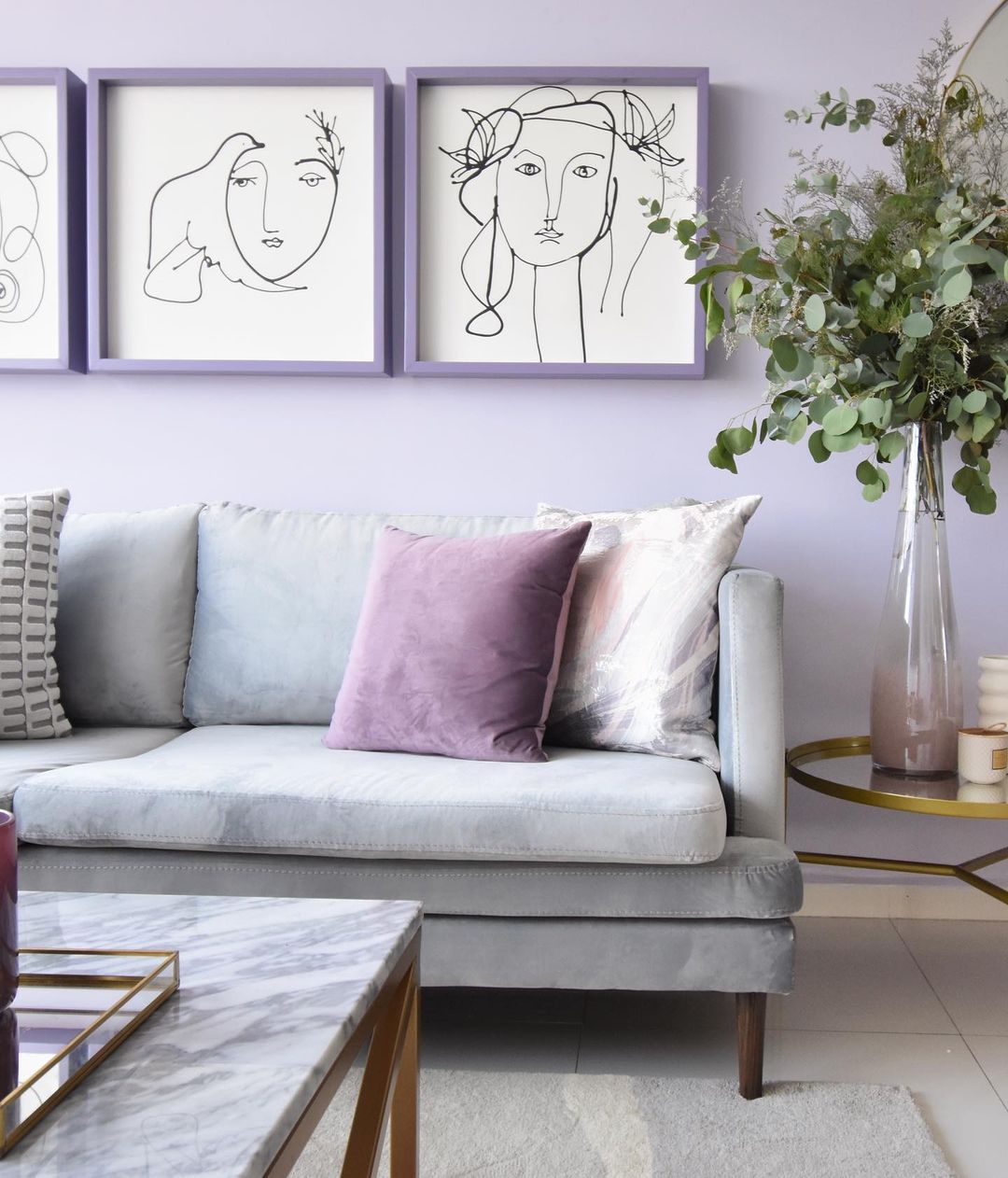
Although in the same color scheme, a lilac approach to purple creates a whole different atmosphere. Lilac is the color of serenity, and it surely will have that effect to the living room feel. This being said, lilac is also playful and youthful and is sure to make a good, light environment.
Navy Blue
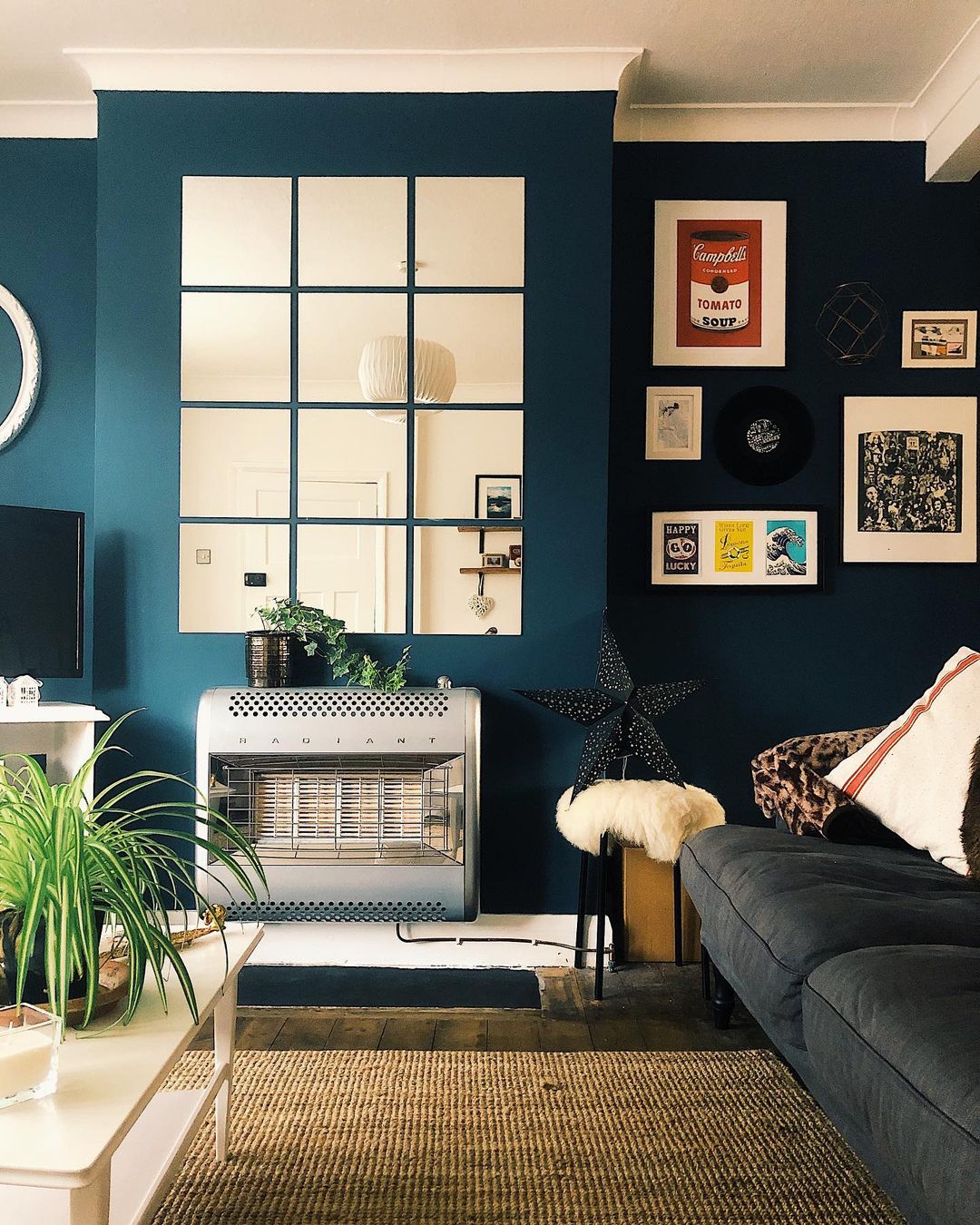
Navy blue is a timeless basic as a safe promise but also an engaging color. If you want a darker approach to the room but don’t want to shrink the space, this is your option. Navy blue gives an ocean feel that creates depth. Another perk of navy blue, is it’s easy to pair with many other colors for decoration.
Teal
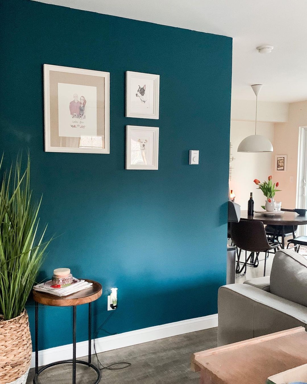
Teal may seem a bit unorthodox but truth is on walls this color looks classier than ever. This is a perfect option to pair with plants without creating and overwhelming feeling. It’s a versatile color that can come off as tropical, classical or fashionable depending on how it’s paired.
Peach Pink
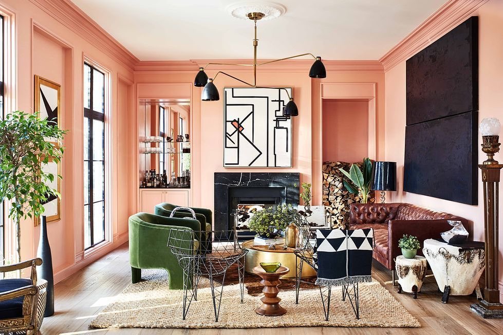
If beige is too classic but you’d still like a light classic, try peach pink. This light color is perfect to create a discrete colorful appearance. It’s comforting as a sweet original nude but still pops out with a streak of joy.
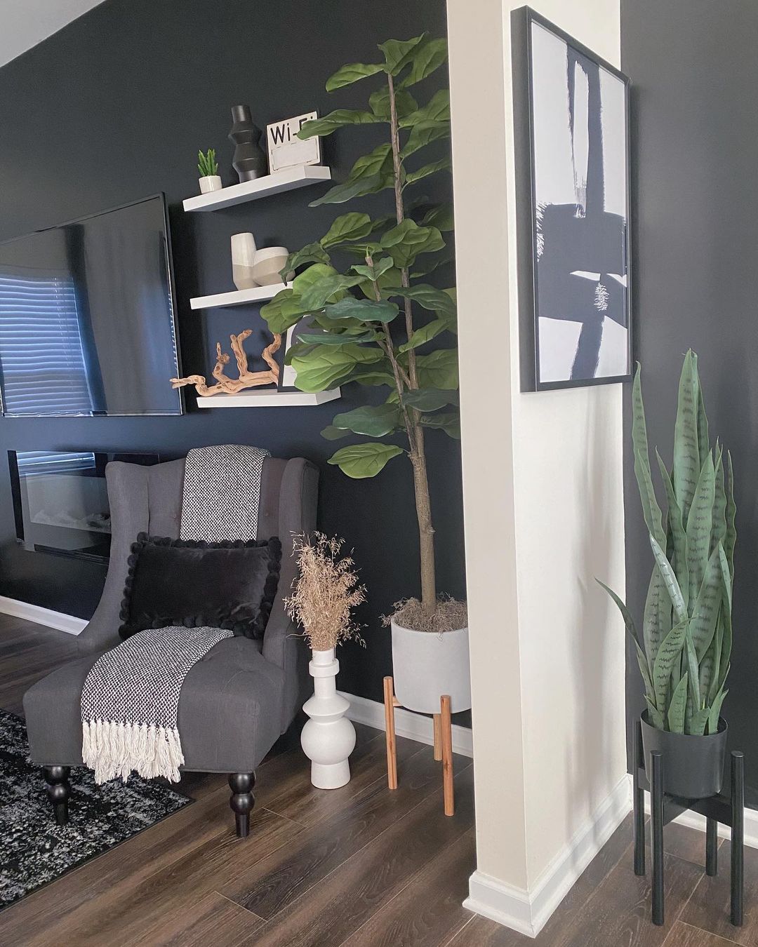
Gray
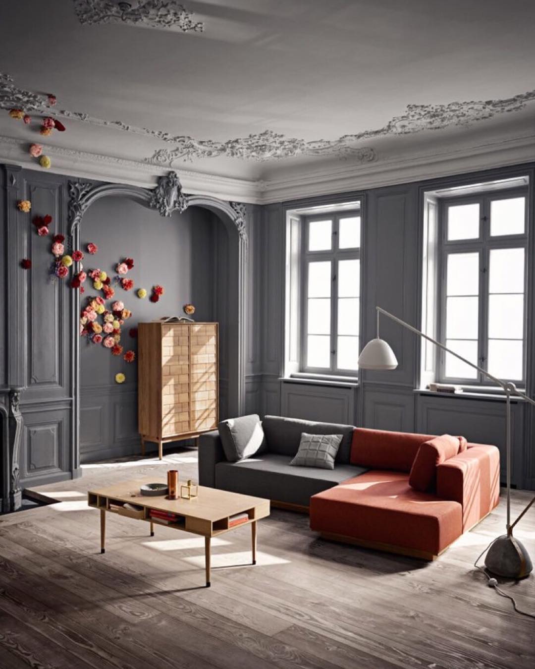
Gray will give a sleek, timeless feel. This color has so many variations from lighter to darker that can create so many different atmospheres. A darker gray like seen in this picture is easy to work with and makes an inviting space.
Brown
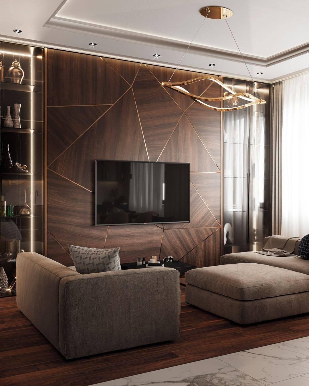
Brown is classic color but not necessarily a classic for a wall color – although we believe it should be! This will create sultry, pleasant energy, similarly to biting into chocolate.
Canary Yellow
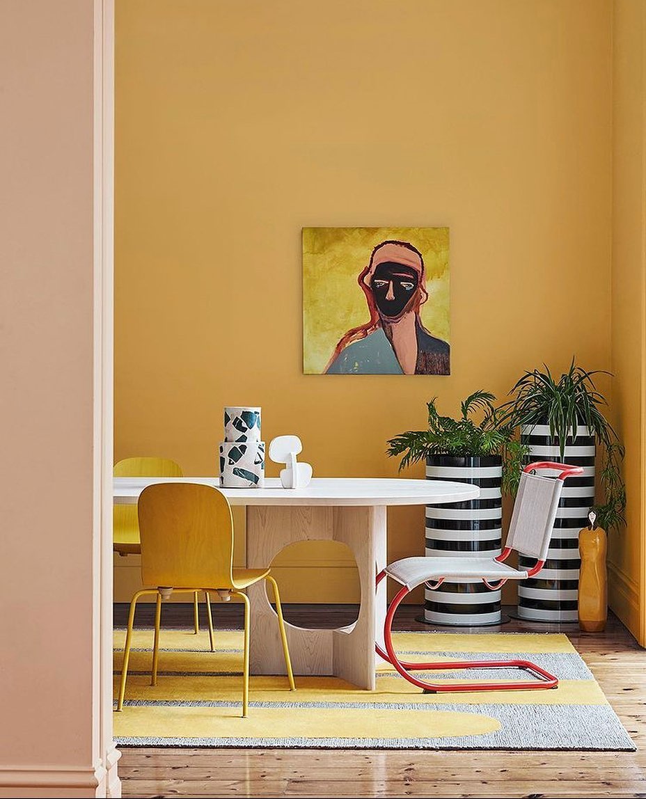
A guaranteed way to brighten up your day any day! A canary yellow is a bit deeper of a version of a yellow that gives off a warmer tone. Your living room in this color is inviting the sunshine in.
Black
If you’re feeling brave, why not black! This is a statement but will tie the room together like no other. If you go for this option, we recommend you just paint one wall black to not make the room too dark. This being said, that one black wall will create a sleek, masculine vibe that is sure to be cutting edge.
Wall paper!
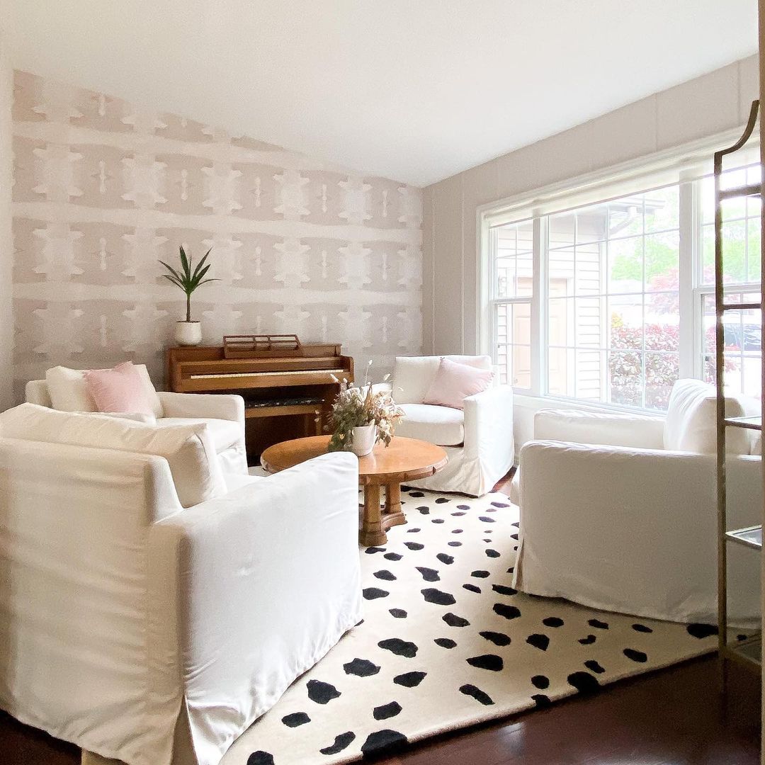
Monochrome may not be for everyone, but there is a vast variety of wall papers that can fill all your creative desires. Today, just about every print, texture and design can be made into wall paper. Explore the options near you and how some may satisfy your taste and vision.
Hopefully these options provide some inspiration for your living room journey. Try playing with variations of these colors, going from darker to lighter depending on the atmosphere you are trying to create. It’s important to consider a color that will make you feel good on the long term and that can be adaptable to variations in decorations. The color spectrum is wide – enjoy playing with options and immersing yourself in the wonders that colors provide. A living room is a key space in one’s life and its designated color plays an important role in this. This is an exciting part of home decoration and personalizing your space to perfection.