What colors go well with green?

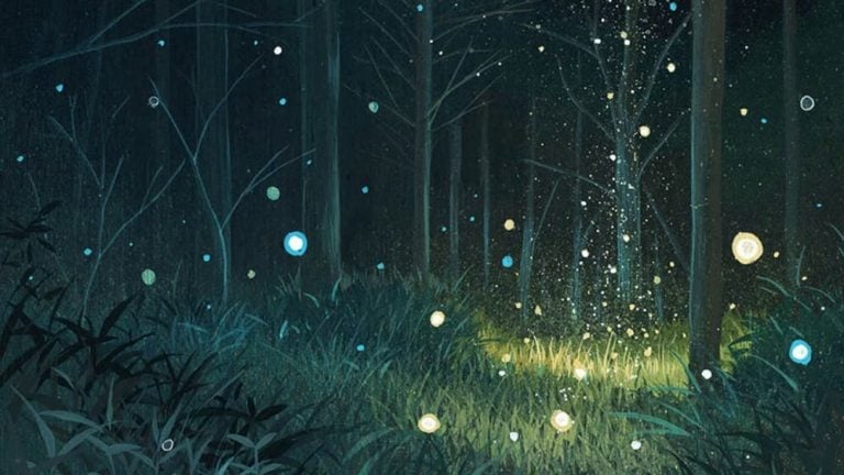
The color green exudes a natural health and balance. It is the color that we associate with a healthy earth and fresh scent. It is the grass under our feet, the leaves over our heads, the herbs in our gardens, the moss that grows on rocks. It is suggesting of nature thriving without interference.

Green is in some ways the lifeblood of the natural world. Most of the green that we see in nature is the result of chlorophyll, the chemical that allows plants to convert sunlight into the energy that it needs to survive. As such, green is the color of energy, health, and renewal.

Green is also associated with balance, such as the delicate balance that we see in nature. Inside of us, it can create a balance between the emotions of the heart and the harder thoughts of the mind, allowing us to find a true equilibrium.

Many colors complement the energy of green.

Red


Green and red make a powerful combination as they are at opposite ends of the spectrum. While green speaks of balance, red is a primal color that reflects some of our most intense emotions. The two mix well, as green allows us to balance and utilize the intensity of red so that we can harness our strongest emotions for our own personal growth. Also note that green and red together might be hard for color blind people to distinguish.

Blue


Green and blue compliment each other perfectly, with green reflecting vitality and health, and blue tranquility and confidence. Together they imbue a strong healing force that can be used for either physical or emotional healing. Together they also support clear and calm communication as the connection between the heart and the mouth is made open.

Orange


If green is the color of natural health and growth, then orange is the color of our natural instincts. The gut reactions of our intuition can be characterized as orange. This warming color adds heat to green’s natural health that intensifies our experiences. The color orange is also linked with optimism, and an uplifting of the spirit.

Purple


While green represents the natural world, purple is the color of the spiritual world. Together the two represent a life in balance, full to the brim with all the things that it needs. Purple is also the color of energy harnessed, and can be the perfecting captain for the natural, neverending, and ever-renewing power of green.

Hailey van Braam
Hailey van Braam

Hi, I’m Hailey van Braam, the founder and voice behind Colorpsychology.org. My fascination with colors goes far beyond their visual appeal. As someone with a Master’s in Cognitive Psychology from the University of Amsterdam, I’ve spent years delving into the psychological, biological, and behavioral aspects of color—how hues influence emotions, decision-making, and even physical responses.

My journey into the world of color psychology began early, sparked by curiosity about why certain colors evoke universal emotions, while others carry cultural or personal significance. I often wondered: Why does red ignite passion or urgency? How does blue soothe the soul? And what role does our biology and behavior play in these reactions? These questions became my compass, guiding me through the intersection of cognitive science, art, and everyday human experience.

One of the most rewarding aspects of my work is uncovering the hidden layers of color. For example, red is more than a symbol of love or warning—it also increases our heart rate and can subtly encourage appetite, making it a favorite in marketing and design. Taupe, with its blend of neutrality and sophistication, provides the perfect backdrop for balance and calm. Meanwhile, royal blue, steeped in history and regal connotations, evokes trust, responsibility, and authority. Each color tells a story, and it’s my mission to help others understand and use these stories in meaningful ways.

What excites me most is the practical application of color psychology. Through my blog, I strive to bridge the gap between science and real-world design. Whether you’re a brand strategist choosing a logo palette, a homeowner selecting paint for a cozy living room, or simply someone curious about why you always reach for the same shade of blue, my goal is to provide insights that are both accessible and actionable.

Over the years, I’ve worked closely with designers, educators, and marketers to explore how color impacts behavior and decision-making. From branding studies to designing calming workspaces, I’ve had the privilege of helping individuals and organizations create environments that truly resonate. The feedback and collaboration I receive fuel my passion and expand my understanding of how deeply color is woven into the fabric of our lives.

Beyond the blog, you’ll often find me experimenting with art projects, photographing nature’s brilliant hues, or reading about historical uses of color in art and fashion. These hobbies remind me that color isn’t just psychological—it’s cultural, historical, and deeply personal.

I believe color has the power to connect us to our emotions, our identities, and each other. That’s why I’m so passionate about sharing my knowledge with a wider audience. Whether you're a long-time reader or new to Colorpsychology.org, I invite you to explore, question, and discover the world of color with me. Together, we can uncover how the right shades can inspire, calm, energize, and empower.

Articles: 81

Leave a Reply

Your email address will not be published. Required fields are marked *