The Brooklyn Nets burst onto the NBA scene in 2012 with a bold new team identity and color scheme to match. Gone were the red, white, and blue hues of their days as the New Jersey Nets – the team was ready to embrace its new home in Brooklyn. The Nets unveiled sleek black and white as their defining team colors, symbolizing the grit and determination of the borough they now represent. Their primary home and away jerseys showcase crisp black and white, often with Brooklyn across the chest in a bold font befitting the Nets’ newfound attitude. Alternate jerseys incorporate gray for a classic urban vibe. Pops of red and blue trim offer subtle callbacks to the franchise’s roots. This minimalist black and white palette gives the Nets a refined, stylish look on the court. It evokes the city’s streets and bridges, high contrast and effortless cool. With their rebranded team colors, the Nets usher in a new era designed to reflect the pride and tenacity of Brooklyn.
| Color | Preview | Hex | RGB | CMYK | Pantone |
|---|---|---|---|---|---|
| Black | #000000 | (0,0,0) | (75,68,67,90) | Black 6 C | |
| White | #ffffff | (255,255,255) | (0,0,0,0) | White |
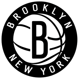
Brooklyn Nets Logo
The Brooklyn Nets logo is known for its minimalist and sleek design. It features a black and white color scheme, which is a nod to the classic, no-nonsense style of Brooklyn, as well as the vintage aesthetic of New York City subway rollsigns from the 1950s. The primary logo consists of a black shield with a white basketball in the center, adorned with a black “B” for Brooklyn. Above the basketball, the word “NETS” is arched in white. The stark contrast of black and white is intended to be bold, strong, and assertive, much like the spirit of Brooklyn and its people.
 |
 |